The 2022 design trends that will make a mark on financial services

The arrival of a new year is often a time for reflection and an opportunity to look ahead. In design it’s no different.
Trends come and go as the years go by and while they don’t just disappear when the fireworks are set off, it’s interesting to see how they continue to evolve. Let’s look at some of them.
The enduring appeal of ‘keeping it simple’
At its core I would argue that this isn’t a trend, but more a staple of good design. Within product design, helping users to complete tasks is easier when the journey they take is a simple one. Our role is to understand user problems and create solutions for them, ensuring that we’re not increasing the cognitive load at the same time.
In the world of branding, we’re seeing brands embrace the idea of minimalism in the execution of their visual identities. Distilling the visual toolkit down to its core of simple typography, a monotone colour palette and simple graphical devices, this process of ‘reduction’ places an emphasis on imagery and brand messaging.
In the world of branding, we’re seeing brands embrace the idea of minimalism in the execution of their visual identities.
Revolut have certainly made their intentions clear, evolving their brand and products in recent times to have more of a utility feel. Promoting clarity around messaging has often been seen as a way of building confidence within financial services for prospective customers. While this will stay true for many years, the visual identities that support brands are starting to differ in contrast to the Revolut approach. Up Banking have a lot of punchy attitude, Habito are pushing the boundaries of what mortgages look like and Cleo reject any notion of financial services being boring. It will be interesting to see how these brands influence the future of branding within financial services.
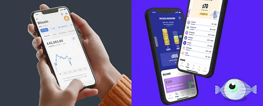
Source: Revolut / Cleo
The continuing rise of brutalism
Brutalism is an architectural style which emerged during the 1950s that showcased bare building materials and structural elements over decoration. Coming from the French term ‘beton brut’ meaning ‘raw concrete’, ‘anti-design’ has grown - taking the basic ingredients of colour and typography and applying them in unconventional ways to avoid usability and intuitiveness.
This non-conforming style is quickly becoming a source of inspiration for brands. Driven by individuality, fashion has taken hold of this style. Brand powerhouses with a strong license, like Nike, are starting to push into new areas in light of this.
As new services enter the market, brands are taking visual cues from this style and applying them in a balanced way to appeal to certain demographics. GORILLAS, a groceries delivery service based primarily in Europe, uses these cues to attract time-poor customers who embrace the lifestyle of being on the move. And let’s not forget Spotify’s 2021 Wrapped! The popular marketing piece pushed the boundaries of readability, treating typography as an art form, and was ridiculed on Twitter for it.
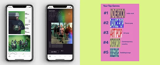
Source: Nike + Gretel NYC / Spotify
Ready for the metaverse?
For designers this is fertile ground for exploring creativity and discovering how design trends will evolve to deliver experiences that people want. There are a number of movements in this space that designers can draw inspiration from.
For designers this is fertile ground for exploring creativity and discovering how design trends will evolve to deliver experiences that people want.
Unless you’ve been living under a rock, you’ll have seen the explosion of the NFT market. This democratisation of art has challenged the perception of ‘ownership’ and opened the door for anyone to create a piece and earn from it. With this, the rise of 3D artists has raised the profile of a style similar to gaming, which will no doubt impact other areas of design. This is characterised by collage based imagery, colour palettes that have a neon quality to them and gradients that use multiple colours like those seen on the Stripe landing page.
By contrast, the VR experiences championed by Facebook Meta have an almost childlike quality. Building calm environments with muted colour palettes and textures in combination with friendly, cartoon avatars makes sense from a UX point of view. After all, you want to avoid any sensory overload so users can complete their awkward virtual conference meeting without feeling nauseous.
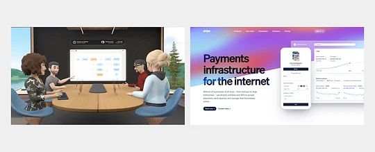
Source: Meta / Stripe
What are we excited about?
Honestly? All of it.
Across many design trends, an inherent playfulness can be seen in the creative decision making process. That’s not to say everything is becoming less serious - more designers are pushing the boundaries and creating more variety in their visual executions.
Typography is being pushed and pulled to challenge proportions and legibility. Colour palettes are becoming quite polarising, shifting from the vivid and energetic through to calm and soothing. The use of illustrations continues to be the centre of your brand’s visual toolkit. What started as Corporate Memphis has turned into a variety of illustration styles.
Customer needs and behaviours, alongside advancing technology, are challenging designers to create truly digital products delivered by engaging brands.
Challenges like designing for microservices that fulfil a particular need, or creating an environmentally conscious brand without greenwashing (or using the colour green for that matter) are what designers like to tackle.
Throw in some glassmorphism, some asymmetrical typography and some ethereal gradients and 2022 is going to look pretty interesting.
And for more insight into the best UX on the market, download the Pulse report. We dive into the best user journeys of 2021 and look at which fintech trends are set to take 2022 by storm.