The 10 rules of deck design for non-designers


I once said to someone, ‘why have you crammed so much content on that slide?’ He replied: ‘because that’s how execs like it’. 🤦
Slide decks are part of life in most companies. They win you business, they secure investment, they educate your colleagues, they give your research a narrative. They communicate messages to your staff… but I bet they also regularly leave you scratching your head.
If you’re lucky, your company has a great template that does most of the work for you, but this isn’t the case in many businesses.
Good slide design is good information design, and good information design creates clarity that will always win over critics who ‘like it busy’. Bad information design is bad business and can mean the difference between profit and failure. Luckily, it’s also something that can be broken down into ten simple rules to transform anyone from deck destroyer to presentation perfectionist:
Decide whether your material will be presented or read
Plan your narrative
Set up clear and consistent section styles
Treat slide titles as labels, not paragraphs
Align content to a grid
The margin is lava
Split content across two slides where needed
Use four or fewer type styles per slide
Establish a visual hierarchy
Control your line length and line height
Now let’s unpack how to put these to work every day…
Setting up right
Before you’ve started to create your slide deck, follow these first two rules to make sure your content flows well — or the rest of your efforts will be in vain!
1. Decide whether your material will be presented or read
In many cases, the answer will be ‘both’, but there should be a huge difference in the amount of information on screen.
For important presentations, it’s good practice to create the long-form ‘leave behind’ deck (that the audience can read through after the presentation or as a pre-read) but cut this right down to a focused presentation deck for the in-person meeting.
Let’s explore the difference between the two.
Slides for reading
Slide decks that will be read by the viewer with no accompanying narrator need to contain ALL the information you want someone to understand. The next nine rules will cover best practices for how to design that information.
Slides for presenting
In contrast, if you’re designing a presentation, you want the attention to be on you as a speaker. If people are reading a slide, they’re not listening to you.
When it comes to designing presentation content, you should only display:
Things you want people to write down
Points you want to emphasise
Themes and topics to guide the viewer
Graphics and images that help people to understand what you’re saying
Some basic dos and don’ts to help you present this information include:
DO use content as visual cues for the viewer
DO use builds to maintain focus
DO break ideas over several slides
DO know what slide is coming next
DON’T put words on screen that you aren’t going to say aloud
DON’T read word-for-word from your slides
DON’T include long paragraphs of text
2. Plan your narrative
When planning your narrative, firstly ask yourself: ‘how long have I got?’
Whether this is the attention span of the reader or the length of a meeting, it can help you cut information that isn’t necessary for a compelling narrative.
Next, you need to understand the narrative arc you’re trying to create. Here’s a typical narrative arc for a presentation, borrowing from a classic dramatic structure that’s served poetry, plays and films well for centuries.
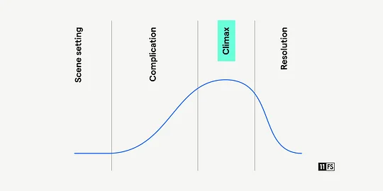
An applied example of this may look like this:
Scene setting — This is who we are, why we’re here, and our world view
Complication — These are your users’ needs, the problem with current products and therefore your opportunity
Climax — This is our product and how it answers that opportunity
Resolution — This is why we’re the right choice and how much it will cost you
Modern political orators have successfully built on that typical narrative arc to employ a ‘persuasive story’ pattern. This can be particularly effective when pitching new, disruptive ventures.
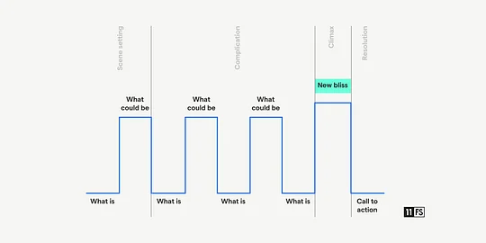
By flipping between the status quo and the opportunity for a ‘better world’, the speaker builds to a crescendo - what that ‘new bliss’ can look like. The presentation then ends with the call to action to the effect of ‘vote for me and this new reality can be yours’.
Once you’ve considered your timing and narrative arc, the real planning can begin. It can help to use post-its to plot your main story points, then add post-its for the detailed content slides beneath each main point, creating the outline of your narrative.
Your next step will be to get your sections and slide titles into the deck. Now the skeleton is ready for the team to collaborate on content.
Orienting your viewer
As we move into design and content creation, these third and fourth rules will make sure your audience is guided through the perfect narrative you just created without getting lost.
3. Set up clear and consistent section styles
A lot of people fail to orient their viewers.
Slide decks — whether presented or read — need clear signposting to let the viewer know what to expect, what point you’re talking about and where it fits within your overall narrative.
By setting up a hierarchy of slide styles, you can punctuate your deck with visual signposts that act like mile markers in a race or chapters in a book.

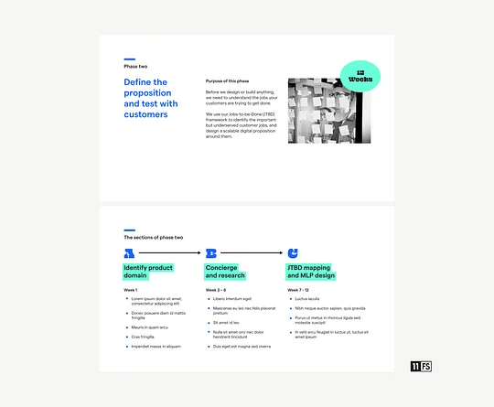
Look at this overview of a presentation template. It’s clear where the sections are, where the highlights are and what is standard content. There are several ways to establish this rhythm:
Consistent roles for slide background colours

Varying type size or type position for section titles
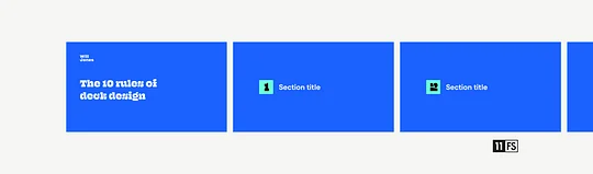
Revisiting an established numerical theme
Once you have a clear hierarchy of slide styles, you’re set up to create the content.
4. Treat slide titles as labels, not paragraphs
As we started to establish in rule one, when you’re aiming for clarity of message, less is more. Police yourself — is that word or that sentence strengthening your audience’s understanding of your narrative?
This self-discipline starts with titles.
A slide title is a device to help orientate your viewer. It says ‘everything you see here belongs to this topic’.
Slide titles are not your opportunity to tell a story or make a lengthy statement
We’ve all seen slides like the one below, where the top of the screen is taken up by a long title that tries to cram the whole narrative of the slide into this ‘label’.
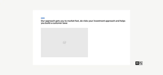
Instead, treat this longer message for what it is: content. If this is the provocative statement that supports your point and sells your product, give it the position and space it deserves.
Using our example text, breaking ‘Our approach’ out as the title orientates the viewer, allowing you to make your statement shorter and more compelling.

As this example shows, your title doesn’t have to be the largest thing on the page, but it helps to be consistent in both position and size throughout the deck.
Slide titles aren’t always necessary
If you’re presenting the deck, consider breaking hero statements like this out on their own. When you have one singular piece of focused content on a page, a title will purely add noise and weaken its impact.
Look at the clarity and power of the slide below.

Laying out content
Regardless of the styles you apply to your content, there are some simple tricks to make sure objects are arranged on your slides in a pleasing way. The next three rules help make sure your content isn’t overwhelming and your viewer understands how to scan it easily.
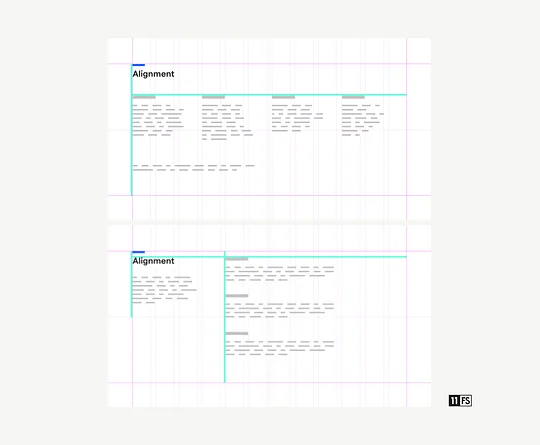
5. Align content to a grid
The human brain loves looking for patterns. We crave things that line up, often looking for order where there is none so we can process the information our eyes are receiving more easily.
Grids have been employed as the foundation of how we order things for centuries, from early printing presses to modern web design. Make sure your deck template has a grid and you’ll find it much easier to create that order.
But what should that grid look like and how do you arrange content to align to it?
The rule of twelve
A typical grid should have twelve columns. As twelve is divisible by two, three and four, this will make it possible for you to spread your blocks of content evenly while still aligning it to the grid.
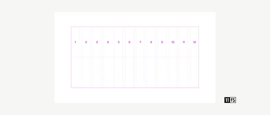
Align the top and left edges
When we’re talking about alignment, look to line things up along the top edge and left-hand edge. You should also be aligning the majority of text to the left (never right-aligned and rarely centred), giving you a clear straight left-hand edge to your block of type.

As you can see in these examples below, aligning to the grid in this way gives everything order, helps groupings of content become clear, and makes the slide easy to scan.
6. The margin is lava
For those that aren’t familiar, the concept of ‘white space’ is the idea that balanced layouts are as much about the space you don’t use as the space you fill.
Your content shouldn’t attempt to fill a slide just because it can. Often, making content bigger with the aim of having more impact has the opposite effect. When you haven’t left enough breathing room around something, it feels squashed and gets lost.
As the title not-so-subtly suggests — don’t place anything in the margin!
Using a strict margin around the outside of your basic grid gives everything enough breathing room — like the moat around a castle. This should be at least the width of one column of your content grid.

It can help to imagine a margin exists around each chunk of content as well — are you placing things too close together for comfort?
7. Split content across two slides if needed
(… or more than two!)
One of the most effective things you can do is recognise when you’re trying to cram too much information onto one slide.
It’s a common myth that a greater number of slides always means a deck takes longer to read or present. If you’re the presenter, you control the pace of progress through the slides, so enjoy the luxury of several slides to break out a concept or point. This allows you to display minimal information and keep the attention on you as the speaker.
Look at this example of a crowded slide. It’s not terrible, but it could be better.
By trying to fit everything onto one slide, the creator has had to break a lot of the basic rules. It has resulted in you, the viewer, having to work harder to understand the content.
Breaking the ideas out over two slides allows you to use your first slide to introduce the high-level theme, even giving you the option of further context with an image. You can then go into detail in your second slide without having to fill white space or rely on tiny font sizes.
Has it taken you any longer to read? Nope.
Was each slide easier to understand? Yup.
The basic rules of good typography
A designer will bang on about typography endlessly and will tell you there’s far more to it than this — which there is — but these final three rules will be enough to help text feel clean and easy to read.
8. Use four or fewer type styles per slide
Using more than four per slide will make it feel messy and unclear.
It’s as simple as that.
When we say ‘type styles’, we’re not just talking about a different typeface (e.g. Georgia, Helvetica, Futura, Poppins), each of the following differences would count towards that limit of four:
A different size
A different weight
A different case
A different colour
If you’re just putting the odd word in bold this doesn’t count as a separate style, you can have those for free.
When it comes to the actual typeface, it’s safest to just use one, with a maximum of two.
9. Establish a visual hierarchy
In rule three, we looked at high-level slide hierarchy across your whole presentation, but let’s explore how you can do the same within one single slide.
Visual hierarchy lets your viewer know one piece of content is more important than another. It tells them what order to look at things and the relationship between two pieces of content.
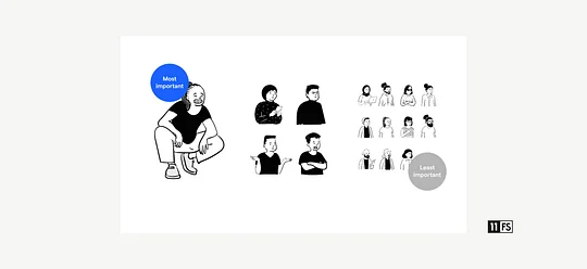
Considering size and positioning
Western content viewers read from left to right, top to bottom. By this logic, if the largest item on screen is in the top left it will be viewed first and perceived as the most important.
Thinking about our previous rule, controlling your type styles also allows you to establish a type hierarchy of titles, subtitles and plain text. This means you can introduce several pieces of content and make sure they’re understandable.
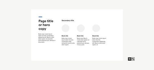
The example above is exactly that: an example. You will need to find the right type hierarchy that works for your content. The more consistent this is across your deck, the less work your viewer has to do slide to slide.
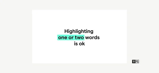
Using colour to reinforce hierarchy
There is often the temptation to highlight words to make them stand out, but make sure it doesn’t become overwhelming.
If your slide design looks like the one below though, how is anyone supposed to know what’s important?

Remember that an underline should not be used for emphasis unless the text is a clickable link like this one.
10. Control your line length and line spacing
We’re nearly there! This is your final rule.
Limiting the length of each line helps people scan from line to line without losing their place, so everything is effortless to read. Controlling the vertical space between each line prevents text from feeling cramped or awkwardly far apart.
50–60 characters is the optimum line length
If paragraphs of text are a lot longer than 60 characters, the reader can get lost, having to move their eyes a greater distance to the start of the next line. Obviously, this range is the optimum, and if you’re a bit below or over, don’t worry. If you’re reading this line on desktop, the line length will be around 75 characters, which still feels really comfortable to read.
If long sentences or
paragraphs of text
(like this one) have a
very short line length,
this can make it hard
work to read as the
viewer’s eyes are
constantly flitting to
the next line, with
sentences broken in
awkward places.
The exception to this rule is when you have a series of very short points to make. As you can see below, laying them out sequentially across the page has a more pleasing impact than just a list of bullet points, helping your slide feel designed, not default.

120–130% is the optimum line spacing
In the world of print design, the vertical space between two lines is called ‘leading’ — literally referring to a piece of lead that sits between two rows of letter blocks. In web design, ‘line height’ is preferred as a term, but your slide software likely refers to ‘line spacing’.
Aiming for a line spacing of between 1.2 (120%) and 1.3 (130%) can instantly make the text within your slides feel lighter and easier on the eye. Opt for slightly tighter line spacing on larger titles and slightly greater line spacing for regular paragraphs.

Don’t forget to be inclusive
As with any information we put out into the world, there are some simple things you can do to make sure your presentations work for as diverse an audience as possible:
Make sure any imagery is representative of a diverse pool of people
Use straightforward and clear language to reduce cognitive load
Your audience might need extra time to read - be mindful of individual needs
For a more detailed read on the different dimensions of inclusivity, we recently published a handbook on inclusive design that makes it super easy to put into practice.
The value of core design skills
So there are your 10 rules!
But why does any of this matter?
Spreading basic design skills throughout your company is incredibly valuable. Not just improving how you present yourselves to the world but positively impacting your bottom line.
If there are designers in your team (or you are one), they’ll likely be asked to quickly ‘tart up this deck for the presentation’ or ‘make this slide look pretty’. Regularly.
When everyone follows the basic rules of good slide deck design, this frees up the time a designer would have spent fixing a presentation, allowing them to focus on designing the products that will push the business forward.
Not only that, but you present a more polished, consistently branded view to the world that extends far beyond your public platforms. That slick, clear information on your fancy website that drives clients to get in touch, is backed up by the same experience during a sales presentation.
If your organisation is debating the value of spreading core design skills, I can't think of two more compelling arguments than a more productive team and greater sales.
Inclusive design - building financial services for everyone
In our latest report, we make the argument against designing for the 'average user' and how FS needs to build products and services that cater to as many people as possible. Take the first step towards making that change and give it a read.
Find out more