Pulse Awards Report – 2020

Introduction
2020 marks the third year of the 11:FS Pulse Awards, which recognise outstanding products, services and brands in the financial services industry.
11:FS Pulse is a platform that contains over 3000 recordings of user journeys from global financial products. The Pulse team, and their colleagues in the 11:FS Research team, spend all day, every day immersed in these journeys and so are uniquely positioned to judge which products, services and brands are leading the way in financial services. They are the brains behind the 11:FS Pulse Awards.
This year we have given five awards that we believe showcase the most impressive offerings across a wide range of areas. The 2020 Pulse Awards categories are:
- Best 'Fintech For Good'
- Best Enabler
- Best User Experience
- Strongest Brand
- New and Noteworthy
Each award’s criteria were decided by a different member of the 11:FS team based on their specialist skill set, and are explained in the chapters that follow. The winners and runners-up were selected by that same person and agreed amongst the wider team.
As a result, we decided that the best people to explain this year’s awards and the decisions we made were those team members, and so each section of this report was written by a different individual.
1. Best 'Fintech for Good'

This award is given to the fintech that we think best demonstrated a significant commitment to providing socially responsible financial services over the past 12 months.
In an increasingly diverse market, a growing number of fintechs are on a mission to create positive social, cultural and environmental change through banking. We have recognised two providers that are genuinely passionate about delivering inclusive and accessible products for underserved groups, driving change within the industry and challenging traditional approaches to finance.
Winner: Tully
Our winner for this category is Tully, a digital debt advice service empowering people to regain control of their money and progress towards a more stable financial future.
More than 24 million people (about 50 percent of UK adults) have persistent money worries, according to research by the Financial Capability Lab. Tully, which launched in the UK in April 2019, recognises the serious negative impact that this can have on people’s lives and promises to provide personalised and flexible help for those struggling to manage their finances.
This sophisticated, free platform has been built to understand a user’s current financial situation in minutes, leveraging open APIs to gain real-time access to account balances and transaction data. Based on this information, Tully creates tailored recommendations for every user about how they should address their current money situation and suggests debt solutions for customers in financial difficulty.
Watch the user journey for Tully’s budget building tool here.
One thing we particularly love about Tully is its truly customer-centric design. During onboarding, users have the opportunity to tell a story about their debts and explain exactly why they are in financial difficulty – making them feel like they’re actually being listened to. The app also uses a carefully selected colour scheme, sensitive to the needs of vulnerable customers, which avoids red and focuses on calming greens and blues.
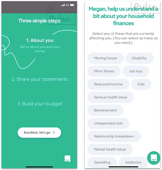
Tully is a driving force helping to improve access to debt advice and financial support for the millions of people that need it today. We look forward to seeing how this product further evolves to enable customers to make positive progress towards financial independence in ways that best suit them.
For more on Tully, check out this 11:FS Homescreen episode with Garry Evans, CPO.
Runner-up: Ellevest
Women are less likely to invest in the stock market than men. This trend persists despite the fact that when women do choose to invest, they tend to outperform men when it comes to investment returns, according to the Financial Times.
Ellevest is a US digital investment platform specifically designed to address the lack of female engagement in investing and "close the gender investment gap". It provides personalised financial plans and exchange-traded fund (ETF) portfolios using algorithms tailored to users’ salary, gender and lifespan.
As part of Ellevest’s mission to make investing more accessible for women, it offers female-focused financial education in-app and via its online magazine – which covers a range of hot topics from investing to careers. Simple explanations of investment jargon are provided throughout the onboarding process to build the user’s confidence and make the process of building a portfolio less daunting.
Watch Ellevest’s customer onboarding journey here.
For the socially-conscious investor, Ellevest offers a range of Impact Portfolios including Women in Leadership (invest in funds that support women leaders and policies that advance women); Sustainable Practices (invest in companies that are working to meet higher standards for sustainability and ethical practices) and Community Development (invest in funds that seek to support developing communities). These diversified portfolios enable customers to contribute towards positive causes whilst still offering competitive investment returns.
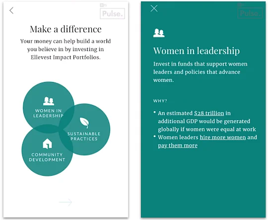
The Ellevest app is engaging and well-designed with a variety of useful features, including the ability for users to set long-term investment goals, customise personal risk appetites and schedule recurring automatic deposits into their accounts.
Ellevest is currently only available in the US, but we are excited to track the progress of this forward-thinking fintech as it helps women reach their financial goals and empowers female investors in a socially-responsible way.
2. Best Enabler

For this year’s awards, we wanted to include some examples of not just consumer facing propositions, but also the firms that are helping your favourite products achieve all the great stuff they do.
When looking at the candidates for this award, we ended up focusing on firms working with APIs; we did so because we saw a lot of these experiences within Pulse, and noticed how essential these were to both banks and fintechs around the world. The winner was decided based on its ability to “get stuff done” in an environment that’s not particularly conducive to this sort of innovation. We also saw that regulatory people and businesses increasingly care about interconnected services in a world where digital products matter – we’ll supplement all our examples with KPIs and regulatory details within the article:

Google Trends data comparing global searches for 'API' (Blue) as opposed to 'KYC' (Red).
These two companies are generally considered Best In Class for their specific regions, and are often compared by the market. That said, TrueLayer is three years younger than Plaid, so that should be considered when comparing their revenue and funding statuses – Plaid’s looks a lot larger in direct comparison. Further, we attribute success to those with partners – these two are notable for the sheer number of external names involved in their journeys. We explain below how they’ve been adopted by their respective markets.

Source: TrueLayer’s page on Owler - https://www.owler.com/company/...
Winner: Plaid
Frankly, this comment in Forbes by Alex Komrad sums up Plaid’s USP very eloquently:
“If online financial planning, stock picking and Bitcoin trading are in gold rush mode, Perret and Hockey [Plaid’s co-founders] have the surefire business: the shovels and pans”
Plaid was a late entrant into this year’s awards, namely due to a certain acquisition by Visa highlighting how successfully it has operated since 2012. Its API tools act as the piping that underpins much of the US fintech market, allowing access to US banking APIs, and offering stable connections to 80 percent of the largest US fintech apps. That enables it to connect to 11,000+ bank and financial services companies, 2,600+ fintech developers and 200+ million consumer accounts.
It’s been able to achieve this in such a fragmented market by building trust around username and password entry points; completing a smart acquisition of Quovo to handle investment, insurance, and loan account coverage; and ultimately offering a more complete financial picture for the user. It’s done a good enough job for Visa to see value in the product and team as they potentially take the Treasury up on its calls for a private solution to API innovation.
Why is this more compelling than our runner-up for the year? As mentioned, this has all been done in an environment that’s not necessarily conducive to this sort of open data innovation. It’s had to be a bit hacky, requiring users to enter login credentials, and that’s risky business. For example, JPMorgan Chase is planning to ban fintech apps from using customer passwords to access data, and has already demanded that Plaid use digital tokens if it wants to connect to Chase customer accounts.
Some big banks see the benefits of APIs; others, it seems, are more cautious about services offered by brands like Plaid. Its ability to grow in such rough terrain has been rewarded with a $5.2 billion acquisition by Visa who, according to its acquisition deck, sees this as a chance to access a “best-in-class platform and team”. High praise indeed!
See Plaid in action here during Olivia’s onboarding journey.
Runner-up: TrueLayer
2019 has been a year of expansion for UK-based financial API provider TrueLayer. The company’s $35 million Series C funding was announced in June, with Visa establishing itself as a key partner. Also included in this round were Tencent, Temasek and a number of previous funders, all drawn in by the fact that TrueLayer is now “responsible for about 65% of all Open Banking traffic in the UK” – a huge market share in a regulatory environment considered the earliest adopter of Open Banking/data.
Another string to its bow is its international presence – TrueLayer has made smart moves by following the regulation into choice new markets. It's taking learnings from the UK’s Open Banking initiative and applying them to Europe and its PSD2 regulation (TrueLayer is now doing business in Germany, France, Italy and Spain). Further, Australian Consumer Data Right (CDR) legislation, envisaged as following a similar trajectory to Open Banking, has provided the latest destination for TrueLayer, which is planning to open an office down under. Impressive for a firm established only four years ago!
See TrueLayer’s Onboarding here.
3. Best User Experience

User Experience (UX) – the way in which a user interacts with a company and its products and services – can be a difficult thing to measure without consulting actual users. But with FS products from over 300 brands to consider for our nominations, I leveraged the team’s unique exposure to the sector and a set of widely accepted usability heuristics to arrive at my chosen products.
So the two parameters by which I’ve assessed products for my nominations are:
- Utility: The product’s ability to solve a problem in the market
- Usability: The ease in which tasks can be completed using the product
Winner: Cuvva
In 2017, Cuvva entered the insurance market with a short-term vehicle insurance product, providing cover for as little as an hour and giving an audience of car borrowers, test drivers and off-the-cuff travellers alike the comfort of knowing they are in fact “Cuvva’d”.
Short-term insurance products often aren’t matched with equally quick customer experiences, making their as-and-when-needed nature redundant if customers can’t access protection in unexpected situations. Though the concept behind Cuvva isn’t new, it’s the firm’s ability to provide peace of mind when needed most, in a simple and transparent way, that seems to resonate with customers.
Cuvva takes the approach of progressively onboarding customers, collecting only an email address before arriving them at a product dashboard. From there, they can select their desired product and complete their profile, giving users an earlier sense of achievement while reducing the amount of personal information required.
The application journey for the motor insurance product is introduced with clear, mission-led messaging wrapped in a visually engaging user interface. The writing follows a casual and enthusiastic style, a trend we’ve seen emerge from many consumer-facing fintech and insurtech products. Form-filling is a breeze and every field uses the correct accelerators and contextual imagery to further reduce cognitive load. Users also have complete context for what they are doing and what needs to be done, with requirements always shown upfront and contextual information made accessible at each step.
Cuvva’s product suite has grown to include learners’ car insurance and single trip travel insurance, furthering its potential relevance in customers’ lives. It’s clear the insurtech places an emphasis on curating user experiences customised to a specific product, and with customers fed up with the long list of digitally-challenged insurance products in the market, the future looks bright.
See Cuvva’s Motor Insurance journey here.
Runner-up: Klarna
Klarna’s greatest achievement has been its ability to seamlessly integrate its own products into the familiar and trusted checkout experiences of thousands of online retailers globally. By providing little more information than what is already given at checkout, users are instantly assessed for creditworthiness before their order is fulfilled and they are reminded of the details of their "pay later", split payment or longer-term financing product of choice.
In some cases, Klarna hasn’t just accelerated customers’ abilities to make purchases but has also improved the user experience of the retailers with which it integrates. Customers of clothing retailers can replicate a try-before-you-buy policy without ever entering a store, for example, alleviating their own anxieties of ordering the wrong size without making any financial commitment – assuming they return the remaining items within 30 days.
Though caution needs to be maintained, as with any credit product, Klarna keeps things transparent with clear communication and frequent reminders of upcoming payment dates. Its order management dashboard reflects its slick branding, but more importantly, it’s also incredibly easy to use.
Klarna products are evolving in different markets around the world. One such product is an app that aims to consolidate its partners’ online stores into a single browsing experience, increasing their presence in the end-to-end shopping journey. Klarna is well-positioned to continue solving category-specific customer problems through its digital-first financing products, and we hope to see them do more of that in the future.
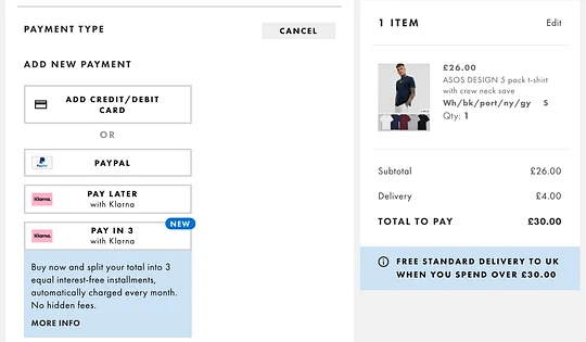
Watch Klarna’s Pay Later journey here.
4. Strongest Brand

Winner: TransferWise
For the third consecutive year we see TransferWise taking home an award, having twice been voted best international money transfer service. TransferWise has this year been recognised for a new category – that of Strongest Brand. We’ve selected two companies based on three key criteria; Pulse design ratings, how well we think they meet their mission and geographic recognition.
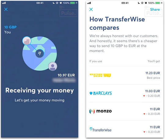
Watch TransferWise’s Payments and Transfers journey here.
Pulse design rating
We found TransferWise’s payments and transfers journey particularly compelling. When making an international transfer, users are presented with a currency chat that uses a distinctive gradient to show the change in the exchange rate over time while also clearly marking the rate as it is today. Once the transfer has been set up, a subtle animation shows money moving two people around a globe, along with the phrase “let’s get your money moving” and a confirmation of the date the transfer will conclude. This interactive approach brings illustrative elements into the journey, making it feel truly on brand and visually engaging throughout.
This journey is arguably core to TransferWise’s proposition and the designs do brilliantly to reflect the true ethos of the brand with its price comparison feature that compares rates with other banks and providers. The design lays out the rates in price order and includes each brand logo to make them easily distinguishable. This signifies the transparency, openness and honesty about rates that TransferWise wants to establish with customers. This, therefore, makes the company a one-stop-shop for FX price comparisons, and using the mid-market rate for FX trading means it’s often the most compelling on price.
How well it meets its mission
TransferWise claims that the world's banking systems weren't designed for people without borders. It has a mantra it adheres to so as to overcome this situation, which is supported by three key principles:
- Be radically transparent
- Charge as little as possible
- Make premium the new normal
Adhering to these principles has been fundamental to TransferWise’s global success. Within the industry, the company has helped establish a new global standard for financial companies and how they treat their customers, with specific reference to transparency in regards to transfer rates and fees. We again point towards the price comparison feature within the payments and transfer journey where users are shown how much each competitor will charge to make the payment. TransferWise will even suggest using another intermediary to send a desired amount if it offers a lower rate. This honest approach to supporting customers, and going the extra mile to make their experience great, has been fundamental to helping TransferWise establish itself as a leader in the international money transfer space over the years.
Geographic recognition
Today, TransferWise is used by six million people all over the world. This global adoption has seen over £5 billion being sent every month with customers saving over £1.5 billion in fees every year according to the company. Its international presence has seen it expand to 59 countries with no signs of slowing down. Even more impressive is the fact that it has a global operations team that offers customer support for various time zones in 13 different languages.
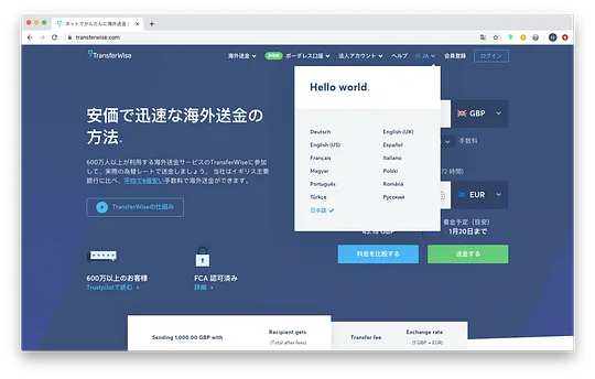
The TransferWise platform can be viewed in 13 different languages.
Runner-up: Monese
Tunde Bolaji, UI Designer
It’s clear that when Joe Allison and team began their rebranding journey in 2016, they put plenty of consideration into Monese’s progressive, human and trustworthy brand identity. At Digitized17, Joe talks about taking inspiration from Futurism and the Constructivist art movements – from artists such as Kandinsky and Alexander Rodchenko. Here we see how Monese has explored visual tropes outside of digital design to inform its decisions and help develop an emotional connection with customers.
Exploring its journeys on Pulse gives us the ability to see how Monese has taken its brand identity and successfully communicated those ideals in its product design. Employing rounded corners on the logo makes the experience more human and the use of curvature conveys motion and therefore progressiveness. Vibrant, playful cartoon characters are littered throughout the app to help explain parts of the journey and to reassure the user of how approachable the brand is. Meanwhile, full-coloured iconography and illustrations give more character to the user experience.
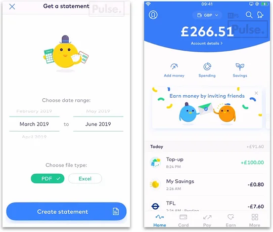
Armed with its mission “to give you the financial freedom to thrive anywhere” Monese appeals particularly to a demographic that struggles to acquire banking products, owing to having recently arrived in a new country. Founder Norris Koppel experienced this when he first arrived in the UK and, since conception, Monese has attempted to make it easier for immigrants to get banked. Its initiatives include free premium accounts for refugees and integration with SignPost to help reduce the number of uniquely-financially-excluded individuals in the UK.
Geographically, it’s doing well – with 1.5 million users across Europe, it’s not yet as popular as Revolut, Monzo and N26, but Monese doesn’t seem to be slowing down. European expansion is going strong – the region accounts for two-thirds of its customer base, which is increasing by 100,000 users every month.
See Monese's Statements and Documents journey here.
New and Noteworthy

The criteria for this award is as follows:
- It has to have launched in the last 18 months. An essential contributing factor, of course, is that the product is new to the market. The company may have launched a while back or beta testing may have been in motion, but this has got to be relatively fresh.
- It has to be a product that fills a gap in the market by meeting a previously unserved need. The excitement surrounding the product has to be justified by the wider market – it can’t just be a slick app!
- It has to have good usability. You’ll be familiar with this one now; the app needs to have a strong UX following high standard design principles
Winner: Up
Coming in first place is Australian digital bank Up. After successful beta trials, the app was fully launched in October 2018. It’s mobile-only, cloud-based and offers multiple no-fee savings accounts with competitive rates.
Crucially, Up is backed by Bendigo and Adelaide Bank, who provide the licensing and product line (for now). As its Co-Founder Dom Pym noted, this “provides [Up] with credible banking authority, coupled with the creative license to design Up in the most ‘non-bank’ way possible.”
True to his word, Up has delivered an engaging, user-centric digital experience – akin to some of the European market leaders and ahead of the native competition. The strong set of functionalities, which include helpful budgeting and bill paying features, are housed within an engaging and intuitive UI. At a leisurely pace, the sign-up process takes just three minutes and payments can be made immediately due to established partnerships with services such as Apple Pay, Google Pay and FitBit Pay.
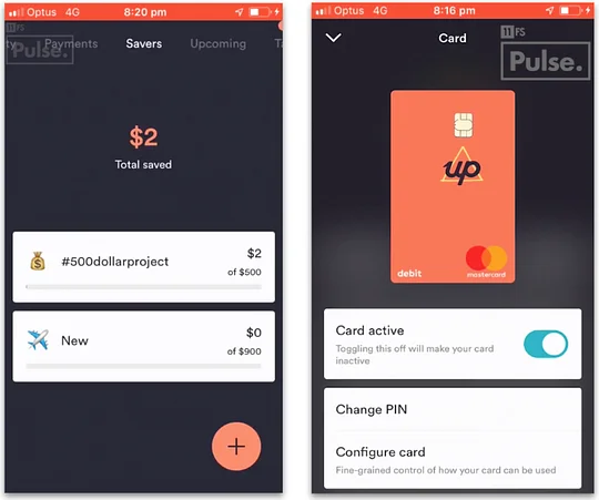
Up has been a welcome addition to the market, where increasingly tech-savvy users have grown disenfranchised with the traditional bank offerings. Australia’s more discerning youth know the type of features that are available to them – whether they be free international spending or auto-categorisations and insights – and Up is providing them with what they want in a next-generation product. Moreover, in the spirit of progression and openness, its roadmap is publically available. It’s a classy touch from a confident and forward-thinking team, that understands the needs and demands of their target market.
It’s not, however, just the shiny app and "Super Powered Banking" on which this lively new product is selling itself. Up is also keen to showcase its ethical credentials by highlighting the socially conscious nature of its partner Bendigo, a company that has “reinvested more than $205M of profits into Australian communities”. Additionally, all welcome packs are printed on recycled paper. With the recent announcement that 125,000 of these environmentally friendly welcome packs have been sent out to date, clearly Up has gotten off to a very good start!
See Up's Savers journey here and watch our interview with them on Homescreen here.
Runner-up: Honcho
Taking the runner-up position is UK-based Honcho. Following three hard years of development, the motor insurance platform was launched in August 2019.
After some slick KYC steps, Honcho arranges a panel of insurers to competitively bid for the user's business by providing and amending quotes against one another. Through this unusual reverse auction marketplace, Honcho has re-invented the ways in which users can receive and choose quotes.
For such a new concept, it’s impressive how polished the product appears. It’s quick and simple to use, benefiting from technology such as OCR (optical character recognition). Relevant graphics and animations support usability, whilst providing a fun and enjoyable experience. Seems like the team at Honcho really nailed it, so hats off.
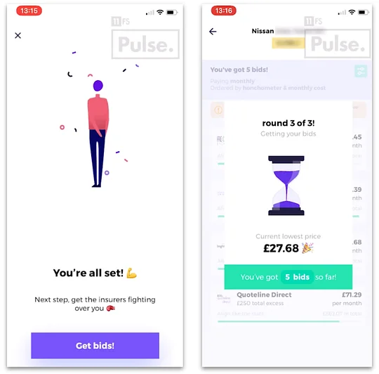
It will be interesting to see if this reverse auction concept gets used in other industries going forward. For now, however, Honcho is well placed – with a heavily underinsured global market, 2020 could well be the year that sees insurtechs make real strides. After a second equity round on Crowdcube was announced recently, we’re certainly keeping our eyes on these guys.
See Honcho in action here and watch our Homescreen interview with them here.
Conclusion
That wraps up this year’s 11:FS Pulse Awards. We hope you’ve found them informative and enlightening, and maybe even learned about a new fintech or two.
If you’re interested in finding out more about the most innovative and interesting products in the world of fintech, then do check out our live video show Homescreen, which showcases the most exciting offerings out there through interviews with the people behind them. You can find the show live on Periscope or on our YouTube channel.
If you would like to know more about the 11:FS Pulse Platform, or about our Research Team and the services they offer, please go here or email pulse@11fs.com.
