The Future is Neon Mint
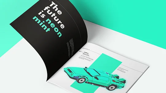
11:FS has come a long way in a short time, and as the company has grown up, so must the branding. It's time to sit down, take stock of how we look and sound and fine-tune our identity.
After nearly three years of rapid growth into consultancy, podcasts, research, core banking and more, 11:FS now successfully has its fingers in a lot of pies. It's time to bring all of those different flavoured pies under one strong, consistent brand umbrella. (There's only one more culinary analogy, I promise).
If it ain't broke, refine it
If your brand has traction and all graphs are pointing upwards, to completely rebrand your company from logo through to name wastes a lot of money. You have to spend a small fortune on changing ALL of your physical and digital assets and then you have to pay to tell people 'it's ok, it's still us!'.
The smartest brands evolve their brand mark to remain contemporary, rather than reinvent, meaning they're still recognisable to their existing customers – the Apple logo from 1977 is millimetres away from where it is today.
The 11:FS logo appears on everything from podcasts to puffer jackets and we have more boxes of swag than a Sports Direct warehouse – we weren't about to rip it up and start again. But, like the varying thickness and imperfect geometry of the 2017 Google logo update, we had some things to fix that only designers may notice, but everyone should care about.
We made minor changes – including making each side of the logo equal and square, changing the thickness of the characters to be consistent and fixing the geometry of the caps on the 'S'.
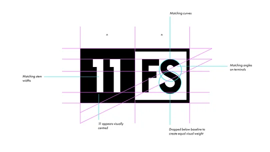
The most visible change, however, was to drop the baseline of the 'S' so it appears to be the same weight and height as the 'F'.
Yes, it's very nerdy, but once you've seen it, you can't unsee it.
Back to the Futura
The next step for our brand was to update our typeface.
Typography is the key to any brand identity. It can affect the tone and legibility, or even place a sentence in a certain era.
We wanted our messages to benefit from the clarity and boldness that comes with a geometric, sans-serif typeface. But also a have timelessness that conveys trust and truth. Modern geometric typefaces can be beautiful, but they often become oversaturated and generic quicker than a 45 degree drop shadow (think Airbnb, Virgin Media and Spotify's use of Circular). And with most customers unobservant of the design nuances, their impact doesn’t always justify the often astronomical price tag.
'30 Essential Typefaces for a Lifetime' by Joshua Berger makes a case for the enduring typefaces that have borne most modern variants that we know and love. Here are the 15 sans-serifs in full:
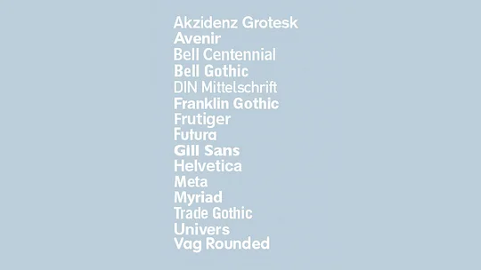
An all-star cast of classics.
In selecting Futura, our messages are afforded the timelessness of a font that, with its elongated ascenders and descenders and unique letterforms, has looked fresh and challenged type-norms for 91 years. It gives us the confidence that our identity won't date quickly, and works for bold titles as well as body copy.
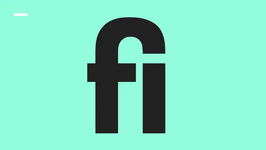
When selecting a brand typeface it’s also important to consider how frequently-used words, brand phrases and product names will look. Unsurprisingly we love to write 'fintech' 'finance' and '1% finished'. What do these have in common? 'fi'.
Handily, Futura PT has a ligature for the characters that's oh-so-pleasing to the eye.
Finally, it is due diligence to look beyond our industry and consider the associations that certain typefaces hold. Due to the various company logos, campaigns and political parties that have used certain fonts to make strong statements over the years, some associations remain in the public subconscious.
Helvetica is the font of the Vietnam War
Paula Scher
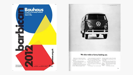
When checking our typeface bedfellows, Futura has been memorably used for respected design institutions like The Barbican and news publishers like USA Today, which matches two of our primary areas of expertise and output.
In the manufacturing and engineering sectors, Futura remains forever associated with the simple, no-nonsense design of Ikea. And the honest, often humorous, long-form print ads from VW in the 1960s.
Confident we had the right typeface, we focused on colour.
Colour
Teal, turquoise, aquamarine. Call it what you will, but for us it’s Neon Mint.
In selecting Neon Mint we considered colour theory to make sure our brand colour created the right emotional space and associations., using vibrancy to feel differentiated in a banking and consultancy space.
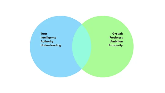
Benefitting from the colour theory behind both blue and green, we reflect the trust, intelligence, authority and understanding that clients expect. We also show the growth, freshness, ambition and prosperity that we pour into every business we create.
In a crowded digital space it’s a benefit for brands to become known for a single colour – Facebook is the blue app, Spotify is green. To keep our communications incredibly simple, we’ve taken a very purist view for our extended palette. We’re black and white and mint, with varying shades for use in different contexts.
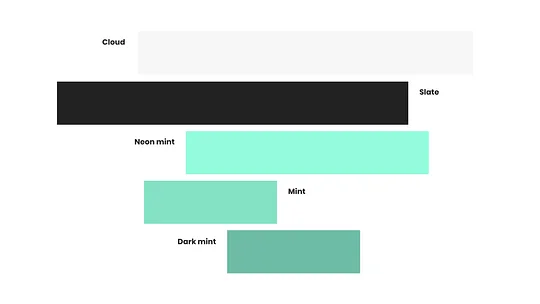
Creating brand consistency with the fewest moving parts
The most important reason to undertake a brand refinement was to bring all of our different entities and activities under the rules of one brand system, creating a branded house rather than a disparate house of brands.
With each entity sharing a core visual identity and set of principles they all work together to strengthen the perception of the whole business rather than dilute it into individual brands and audiences.
The first step of creating this system is to group different entities based on the function they perform within the company and for customers. For 11:FS this gave us 3 categories – Masterbrand Services, 11:FS Products and 11:FS Presents.
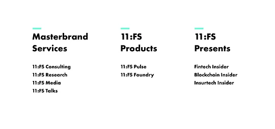
With our activities categorised, we created standard logo formats for each, helping customers understand which area of the business they’re engaging with. And it gives us a shortcut for branding future activities.
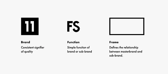
This approach relies on using a very small number of design ingredients with defined roles. To help each sub-brand logo lockup feel like an extension of the masterbrand, this set of ingredients came from our primary logo.
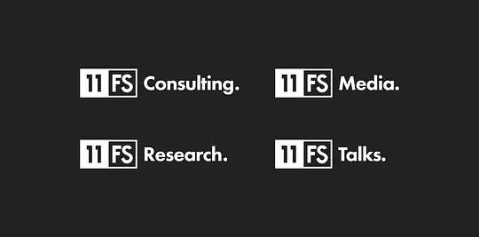
Masterbrand services
Our masterbrand services are the activities core to 11:FS. These are an extension of the masterbrand so are simply written on the same line as the logo. These activities are people-powered, based on productive conversations so they are written in sentence case rather than capitals. The trailing full stop adds authority.
11:FS Products
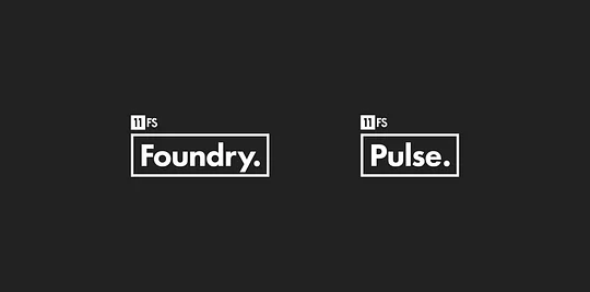
11:FS Pulse and 11:FS Foundry are a big part of 11:FS but exist as products in their own right, therefore the frame device surrounds the product name itself.
11:FS Presents
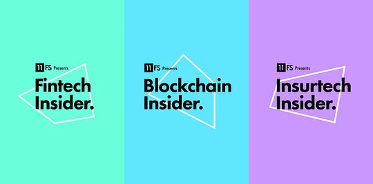
Like our products, our podcasts are a big part of 11:FS, but they exist in their own right with distinct audiences. Discussions are colourful and don’t follow a formula, they're a group of people debating their point of view around a topic. This is reflected in the abstract shapes of the frame device.
To help each podcast feel distinct and stand out within a crowded podcast market, the colour palette has been extended to include a vibrant shade for each, selected to complement the primary brand colour.
Rolling out
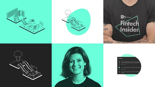
Combining this tight set of brand rules and ingredients with a revised tone of voice and brand principles, we built out the rest of the brand assets ready for launch. We rolled out our brand refinement across our digital channels and merchandise.
It’s no longer enough for brands to take a look at their shiny new identity and think ‘this looks great and sounds right, I can rest on my laurels’. Motion and branded interaction design add that level of magic that customers have come to expect. Our next phase is to work on our digital dance moves.


