Design drill down #5 | Spotlight on French fintech

In this design drill down, we’re looking at how top French fintechs are transforming the way we bank with gesture-based actions and how they are simplifying insurance by putting the customer at the heart of the experience.
Gesture-controlled finances
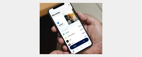
In product design, a user's experience is often described as simple and intuitive. But how often is that truly the case? Financial super-app Lydia believes in ‘doing more with less’. This has led to some interesting features and interactions to utilise them.
Looking to remove the complexity from banking, the Lydia team has built a suite of features that feels seamless to use and allows customers to easily achieve their goals. Its innovative use of sub-accounts that can be used in a number of ways, including shared accounts with friends, is a standout feature for acquiring new customers.
Sharing between accounts is certainly an intuitive design feature. The ability to press and swipe funds from one account to another makes the experience feel seamless. Doing so creates a short and succinct user flow when it comes to entering details. Users can complete transfers quickly.
Overall the user experience of the Lydia app places an emphasis on completing actions. Additionally, the visual language is welcoming and focused. It’s evident that care has been taken to place the user at the centre of the experience. It’s a great example of what can be achieved when a mission is applied throughout the full execution of delivering a product or service.
Giving health insurance a once-over
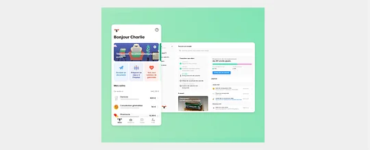
There’s an emerging trend of fintechs that aim to simplify the world of health insurance and tailor the experience to individuals. Alan is on a mission to do just that.
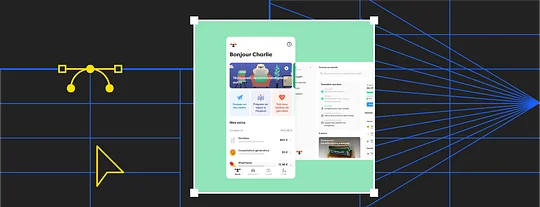
To support their mission to create a health insurance experience that can change users’ lives, Alan has a clearly-defined feature set that ladders up to their ambition. Users can consult with a doctor, track their claims in real-time and receive refunds via instant transfer all within minutes of launching the app.
Alongside this multitude of features, the clear interface helps to guide the user through the insurance minefield . Users are greeted by a dashboard that provides a view of their tailored insurance plan and any relevant quick actions or next steps. In progress claims can be monitored and tracked with ease, a reassuring moment at a time of uncertainty.
Accompanying the clean UI is a brand that stands out in the healthcare space. It feels warm and familiar, making use of an animal mascot that makes the product more approachable. The blend of purposeful and minimal UI combines with playful brand illustrations and character to make the user feel secure and informed. The product appears more trustworthy and human.
Having recently secured another round of large investment, it will be interesting to follow Alan’s next steps and see how the brand and product features evolve on its mission to improve insurance and healthcare.
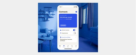
Rethinking home insurance
French start-up Luko has attracted over 100,000 customers with its fresh look at home insurance, providing a more tailored and flexible experience to its users.
Unlike other insurance providers, Luko isn’t striving to generate its margins through premiums. Instead they take a 30% cut of a customer's contribution and pool the 70% for compensation payouts. At the end of the year, a user can select a charity to donate any leftover funds from the pool.
Starting with a quick and easy onboarding process, Luko provides a tailored quote in minutes. A chat interface makes users feel like they are talking with Luko and shaping the perfect insurance package. Not a generic quote in sight.
At the heart of the experience is a UI that feels clean. White space is applied generously to allow content to breathe and give the user time to digest information with ease. A strong call to action colour, using the brand blue, guides the user through journeys and highlights the most important actions at the most relevant times. The clean UI is partnered with a more organic and crafted illustration style that subtly contrasts with the more functional UI. It acts as a signpost to areas of the experience that are more content-focused rather than action-oriented.
Using smart home devices, Luko plans to proactively protect homes and tailor its insurance offering even further. They plan to supply water meters that detect leaks, and security systems, alongside providing the ability to book an expert to reduce any burden on the user. Once the work is carried out, insurance payouts and refunds can be paid back to the user directly through Lydia, making the whole experience as painless as possible. It will be interesting to see how they begin to integrate smart technology into their existing experience.
To have examples of the best financial services design and UX at your fingertips 24/7, check out 11:FS Pulse.