Design drill down #4 | Back to the drawing board
In this design drill down, we’re looking at products and services that have gone back to the drawing board to solve a problem in a new innovative way.
Rethinking video meetings
With online collaboration and video meetings now the default approach in most industries thanks to the pandemic, many of us now spend a large proportion of our time talking to others and presenting material on Zoom or similar. Meetings where attendees are placed rigidly in boxes. This is where issues arise - the disconnect between video meetings and how they occur in real life.
This is why mmhmm has taken a different approach to video meetings. In their own words they see each meeting as a ‘performance’, with a product built around that simple concept.
We’ve all asked: ‘can you see my slides?’, making the audience redirect their attention and choose between looking at you or the material that you’re presenting. Mmhmm allows the presentation of slides within the same frame as the presenter, placing the emphasis on you as the presenter to deliver the real value of the meeting - much like how news presenters are positioned.
The presenter is given full control allowing them to easily switch how slides are presented, either full screen or in-window. They can also move themselves around the frame, placing themselves in the centre of the screen to help deliver a strong message. Or shrink into the corner to ensure viewers see the detail of the presentation.
Often presentations are made by more than one person and mmhmm has recognised this, allowing two people to edit and control a presentation with its co-pilot mode. This reduces the need for secret hand gestures or repeating ‘next slide please’.
As we venture further into the world of video meetings as the default approach, it will be interesting to see how products and services like mmhmm will influence our behaviours and expectations.
See mmhmm in action here.
Managing budgets, made better
Nearly all new fintech start ups, neobanks in particular, offer functionality that allows you to put money aside rather than moving it to a completely different savings account. Whether it be saving for a short weekend break, or even a house deposit, simply setting this money to one side and keeping it available seems to be the baseline function for the majority of new banks.
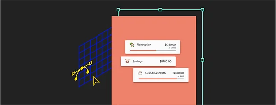
Australian neobank Up offers this functionality in a way that shows it really understands the way people behave with their money. Rather than follow the crowd and simply offer a structure for moving or segregating money, they acknowledge that the majority of people have a very fluid relationship with money and that behaviours and habits can get in the way.
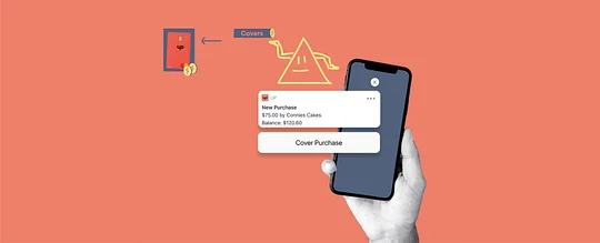
With the addition of covers and forwards to their feature set last year, they provide two very powerful ways to keep your budget balanced: moving money to and from your ‘Savers’ pots. This is a very convenient response to how spending money with your card may play out in real life. By way of explanation, let’s take a look at the example Up use themselves on their website. Say you are saving to buy a cake for Grandma's 90th and have set money aside in a separate ‘Saver’.
When you spend the money on a cake for Grandma you may be temporarily out of pocket. But with one interaction you can cover that payment with the money you have set aside, so that overall your budgets and spending remain balanced. Covering an expense from somewhere else is something we all do almost every day, and by introducing this feature Up have made that process as easy as possible when spending with your physical card.
An easier way to gain research insights
Dovetail does something in common with a lot of products that could fit in this list: it serves a niche. It allows researchers to easily get from videos of interviews to transcriptions and insights, effectively eliminating several laborious video editing and transcribing roles in the process.
The feature-set feels designed around a true understanding of the outcomes that strategists need to get from research interviews, and the mental model for breaking down large video-based data sets to see trends.
My favourite aspect of this is the ability to tag words and phrases in the transcript with multiple tags and automatically get a compilation of the corresponding video clips around any aspect of demographic or topic.
While the power of this is to make the customer research synthesis process truly digital, it also removes the time vampire that is outputting materials for stakeholder decks. Big fans.
So, there you have it. Three of my favourite brands that reimagining the solutions to customer problems. What are your favourites?

