Design drill down #2


In the second of this monthly design series, we look at a rebrand done right, an app that bids to be the future of car management, and one firm designing a better relationship between finance and the environment.
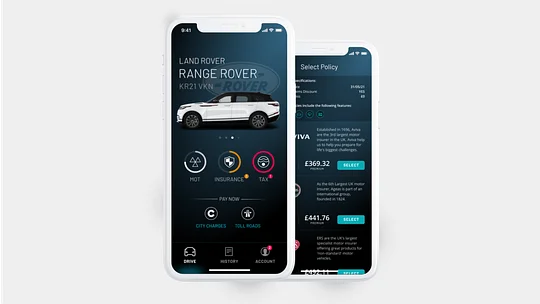
🚗 Car insurance with Caura
Caura is the one-stop app for all things car management, allowing its users to manage all of the things that the modern driver needs. From ULEZ & congestion charges, to MOT and insurance reminders, making sure you don’t risk falling foul of the nasty penalties.
Customers are almost instantly onboarded. By simply entering their car registration, they unlock a dashboard, personalised with an image of their car and a clean UI that highlights upcoming payments and serves as a health check for all your car finances - finally all in one place!
Actions are quick and intuitive, ensuring that a user is no more than a single tap away from uncovering additional information on their car finances or making a quick payment.
But what’s next for Caura? Fresh out the back of a successful funding campaign, Caura have now secured £3million of funding, backed by Jaguar Land Rover. Their next step is embedded finance, aimed at reducing the cost and time taken to insure a car.
Caura has aimed to take the hassle out of insurance, reducing the number of questions you need to answer, enabling its users to get a quote quickly and then compare against other providers within the app. Once a policy is selected, users can checkout with Apple pay, and receive all the associated documents in-app, continuing to be the one-stop shop for car management.
Doconomy has torn up the conventional rule book
This everyday spending account tracks the CO2 emissions generated from your transactions and then displays that data in a simple app through a gorgeous array of visualisations. While other fintechs have addressed similar issues, Doconomy has torn up the conventional rule book, by actually creating their own climate impact measuring index.
The Aland Index, a collaboration between Doconomy and Ålandsbanken, easily enables users to connect the purchase price of a product with the effect on the planet measured in CO2/kg. This allows their customers to truly understand the cost of their purchase behaviour on the environment. Investing and offsetting for positive impact is done through Doconomy’s partnership with UNFCCC certified projects, so customers know their money is working harder for them, and the planet.
a truly revolutionary way of attempting to ignite positive behaviour change.
An offering later this year of DO Black, a radical credit card with a CO2 emission limit stopping you from overspending, based on the impact of your consumption, is a truly revolutionary way of attempting to ignite positive behaviour change.
Their website is a little bit lovely too. It’s fair to say we’ll be keeping an eye on them.

🎨 A classy rebrand that elevates content
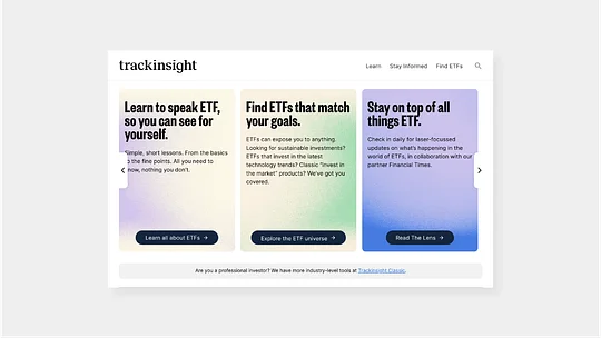
Trackinsight, a company which helps investors compare ETFs across North America, Europe and Asia, has gone through a rebrand and we’re big fans.
At 11:FS we often lament the popularity of fintech ‘blanding’ – the race for new entrants to fit the vibrant colour + geometric typographic logo + playful language + minimal UI mould that often sees them become invisible in the noise. This is not one of those rebrands.
Trackinsight’s strong identity not only reflects ever-shifting financial markets, but the strong colour fields of gradient and texture help solve a design challenge that all content-rich platforms face – how to make content cards more engaging and ownable? Some look to solve this with background images, but these take time to source and can make the UI too busy. Others use block colour which can create a confusing interaction language, or just simple white throughout which has no hierarchy and isn’t ownable. Problematic.
This identity though gives Trackinsight pastel gradients for use on content cards and all the pitfalls of those other approaches gracefully disappear.
It looks like there is still some work to do to fully realise the new brand through their online presence, but they’ve got the toolkit to make something really impactful. We’d love to see some subtle motion...