Best Design


Users of Pulse will no doubt be familiar with our visual design rating, which sits at the bottom of each post and gives our analysts’ view on a journey’s design strengths.
So, for this category, using this information, we were able to draw on a large resource to find our winner. It was a really difficult decision to reach, but ultimately the winner showcased the importance of radical design thinking and collaboration, using design giants IDEO and the “Jobs-to-be-Done” framework, to build their product.
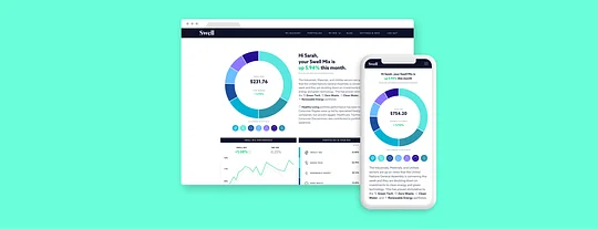
Winner: Swell
In essence, Swell combines the high-level job that a user wants to achieve – growing their personal wealth when the housing market is no longer a viable asset – with the lower-level job of investing in tech-centric, environmentally-friendly and “good” companies; and understanding the language and products that they are investing in.
Swell taps into a customer job we see consistently showing as a top priority opportunity
Ryan Garner - Jobs to be Done Lead, 11:FS
The onboarding process reflects this ethos, making good use of well-designed icons to consistently add insight throughout the journey, and to illustrate what sort of mix the user is investing in. For these reasons, and the company’s collaboration with IDEO, we gave the journey a five-star rating for usability and visual design. Further, we found that their variations of blue and green, which appeared throughout, provided a really clean and natural colour palette. Our colleague, and Jobs-to-be-Done guru, Ryan Garner, sung the brand’s praises:
“Swell taps into a customer job we see consistently showing as a top priority opportunity, the job of helping customers grow their money. What I like about Swell is that it's proposition removes a lot of the constraints we see to investing: like complicated language, highly technical user experiences and most importantly making it easy to invest in businesses driving forward the sustainability agenda. Businesses like Swell will be at the forefront of tapping into the growing demand from customers who have never invested before and are priced out, or turned off by, more traditional investments like property.”
The process was first and foremost collaborative, and we’ve seen examples of this working well for KBC Ireland (who collaborated with Zoo Digital on their onboarding), so it would be fitting to get some insight from IDEO on how the partnership worked:
“Embedded as core team members, IDEO designers worked alongside Swell’s founder to shape the company. In just one year, they went from an initial concept and prototype to an SEC-registered investment adviser with a fully developed business model, a digital platform with initial investors, and well-defined branding that set the look and feel of the values-driven company.”
Runner-up: Lunar Way
Danish Wallet Lunar Way, which has seen large take up in Denmark as users grew weary of Danske Bank’s – MobilePay’s parent company – money laundering controversies this year.
Our analysts gave Lunar Way’s journeys a great set of ratings across the board, owing largely to their striking dark design, with colours like purple and neon green accented beautifully on these backgrounds. Further, their use of images and playful white typeface really accent the background, so this is a really successful and minimal design.
You can see the journeys for yourself over at 11:FS Pulse.