UX in finance: getting it right
Introduction
Consider this scenario: you are a user with a task that needs completing via your financial platform of choice, and when you set out to achieve this core task you run into friction which either slows your progress or – worse still – prevents you from completing the task altogether.
There are a number of core tasks which we would consider essential for those using financial products in 2018, and this report sets out to explain how we think they should be approached by service providers: first, the process by which a user onboards to an account; second, logging into an account on an alternative device; third, the process of blocking a card that may have been lost or stolen; and, finally, making a payment. We will provide examples of poor user experience for each task, and then showcase an example of best practice, so that you can see how we think you should be building out these experiences.
How have we identified negative experiences?
Using a combination of competitive analysis and heuristic evaluation, we identified a number of user journeys that fell short of certain industry-standard usability principles and compared poorly to other products in a similar space.
In some cases, a user journey’s failure to meet these standards was a direct result of the cognitive load it put on its users, through an abundance of required clicks, input fields or the use of external devices. Such cases are highlighted in the report.
Though we would suggest conducting user research using a number of different qualitative and quantitative methods, employing heuristic evaluation and competitor analysis provides a cost-effective way to gain a snapshot of how a user journey or product performs against a set of widely accepted usability principles and comparable competitor experiences.
We also conducted interviews with key stakeholders that we judged to be successful to try and understand why they made the decisions they made, and what the benefits were of this for the business.
The UX of Onboarding
Our colleague, Sarah Kocianski, has written at length on the topic of creating valuable onboarding experiences, with great suggestions for how the best manage to get around these traditionally friction-heavy processes. What can be said, though, is that sometimes even the more digitally agile of these onboarding experiences can go wrong. So, though we are huge fans of the Habito journey below, it is important to identify where improvements to these young services can be made. Comparing the chat functionality used by both Habito and KBC Ireland, we can draw lessons about how to get the best out of chatbots that are invariably making great strides to improve this area.
Habito
Having a chatbot to help with the onboarding process is undoubtedly a great way to ensure that the user’s basic information can be captured and processed efficiently. Habito’s onboarding bot does this well, and there are a lot of strengths to this journey.
That said, Habito employ a handoff from one chat function to another, which is housed within the site’s Intercom. Here, the process starts to generate problems. Firstly, the user had to go back and remedy errors made in previous forms, then resubmit, which is a considerable time drain. Further, Habito explain the system before the user begins interacting with the chatbot, explaining what help and edit buttons look like, where to find them and when to use them. It also tells users to select “Yes”, even if they are not certain an option will apply to them, instead of offering an “I don't know” option – if there needs to be explainer text for each action, the service is no doubt too unintuitive.
There’s an inconsistency here in terms of the use of chatbot and of forms, which generates some confusion; we’ve found that the best examples of bot onboarding ensure consistency throughout the process of entering user data, and to process that via one system.
Finally, it’s very confusing to have what looks like a built-in chat system and then open Intercom. Especially for those used to using Intercom for customer support – it's clear two systems are in place when one has to ask the user of the state of another. Asking users if they see certain buttons on a previous page puts too much expectation on the users, and also the vagueness of the handoff really doesn’t help the user bridge the gap and arrive at the relevant next chat feature. “Do you see a button to continue anywhere on your dashboard?” the message reads – the system should know where the user is, and be able to guide them. The above issue ultimately causes task failure, and the user is left without a quote. The opportunity is missed.
So, how should a chatbot be used in the onboarding process?
KBC Ireland
KBC Ireland’s market-leading chatbot remains the benchmark for bank onboarding, and really gets the basics right when it comes to the usability of their onboarding process. Clear exit paths and help options are made available throughout the whole process, and KBC ensure that the system status is visible whenever it is processing information, with clear contextual messaging: "We're saving your details", "Your phone is being secured," etc.
The bot also indicates whether certain services can be used immediately (IBAN, Apple Pay) or when the user can expect them to be made available (card delivery times). Users are also offered flexible login and payment options through OS-specific services (Touch ID, Apple Pay) and integration happens within the app. What does this do? It adds instant value to the user, and makes them feel as though the process has ultimately been a worthwhile one due to an immediate payoff.
KBC puts users through a carousel of very strong unique selling propositions before asking for any customer details, some of which act as prerequisites so that users are aware of what they will need to complete the task. At the end of the onboarding process a five euro sign up bonus adds an element of reward to the process, and acts as a sort of gamification tool.
They opted for a chatbot-driven onboarding process which not only adds a unique conversational feeling to the process, but reduces the normal form-filling requirements to a single text field, requiring no scrolling or jumping between numerous fields. They also provide an edit button next to each entry to rectify any errors. Not only does this ensure that mistakes are able to be corrected easily, but helps to ensure that the user is moving through only one format during the process – consistency in this regard results in continuity, and ultimately ensures speed. This is reflected in the time on the task: four minutes and the user is onboarded.
KBC also ensure that there’s a limit to the mistakes that can be made within the actual data entry process. Relevant keyboards are provided to input information in the correct format, helping match between the system and the real world. When asked for a date of birth, for example, the user is given a date keyboard and when asked for their phone number a numeric keyboard is shown. This reduces user error and increases the speed in which users can input data. This is a really basic feature, but it is noteworthy how many big banks seem to get this wrong! Further, this ensures that clean data comes through the bot and reduces the workload on KBC Ireland’s end.
Why does all this matter? KBC Ireland customers are onboarded quickly, with the user’s workload small as a result of a system that is adaptive to the data they are asking them to enter. The user is exposed to only one system – the chatbot – which reduces friction, and a reward at the end ensures that the process leads to an immediate payoff for the user’s efforts. The bank collaborated with a Dublin-based design agency – Zoo Digital – who offered a real customer-first design approach to the interface.
The UX of pre-login security
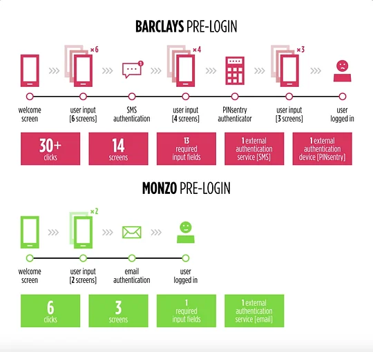
When a user is logging into their account for the first time on a new device, the bank – in this instance Barclays – takes the uncomfortable step of forcing the user through a laborious process to identify themselves. This is a common issue, with the average European smartphone user switching devices every 21.6 months, and with the UK market only slowly making progress with regards to promoting current account switching, it is likely that most UK financial product users will encounter the need to log into a new device. So, in what way are these journeys unhappy? Quantitatively, we can compare the steps undertaken by Barclays with a competitor in the disruptor space – Monzo. The steps are as follows:
- the number of clicks the user must make,
- the number of input fields,
- and the need for external services and devices.
Monzo and Barclays both need to minimise potential friction if they are to ensure that users will continue to use their services beyond the typical two-year cycle of a mobile phone contract, and so we can work on the assumption that less steps would result in less friction for the user.
Barclays
With millions of customers in the UK alone, and with a large proportion of those likely to switch phones a number of times due to the nature of mobile phone contracts, it's increasingly important that account holders are able to make the device switch seamlessly. Barclays users have to undergo a number of hurdles before they can access their mobile banking.
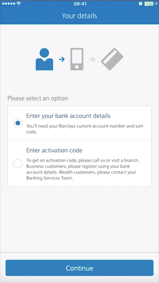
The first thing to note here is that an external device – Barclays’ PINsentry card reader – is required for full access to the service. Though not as much of a problem if the user is at home, any task requiring this tool when on the move will be less-easily achieved.
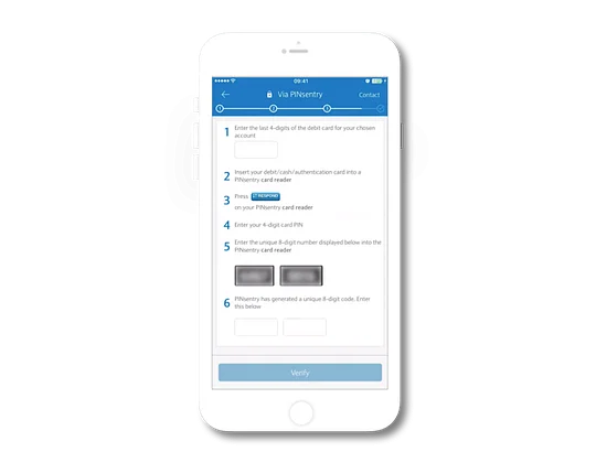
Further, SMS is required to authenticate the user’s identity. Thorough, but not efficient, this journey requires huge interaction cost. The user must:
- undergo over thirty clicks within the app,
- 13 input fields must be completed,
- navigate to one external service from SMS and one external product: PINsentry,
- The user is required to take on a high memory load, requiring personal details and bank account details.
Monzo
How have the challenger approached this complicated process? They have put their trust in their Magic Link technology, with the hyper-secure processes that others practice making way for friction-free ease of use. To the user, this means:
- Only completing six clicks to gain full access to the account
- Entering data into one input field (entering your email address)
- Using one external service (the user’s email) with no external devices
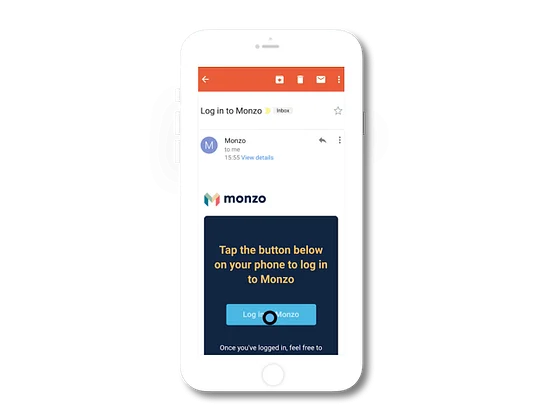
For Monzo, this technology – though unfamiliar to those used to more traditional forms of verification – is just as safe, if not more:
Because we don't have passwords, there's no chance customers can have their passwords compromised. Plus, not having passwords also neatly blocks credential stuffing and screen scraping, and encourages people to use our API.
Simon Vans-Colina, Engineer at Monzo
For the user the memory load here is very low, with Monzo requiring only an email address (through which they send a Magic Link) to complete their verification. Second, the fact that a user’s email can be accessed, even if there is no mobile network or the phone is lost, ensures that the user is not tied to their phone with regards to the service verification. The “Open in-app” button accelerates the process for those that have their email app installed on the same phone, which perfectly illustrates the fintech’s ability to remove friction from the experience. Finally, a high level of visual design, which uses animated images and custom made icons, engage with the user throughout the process, as Monzo's lead Product Designer suggests:
Rather than asking you to remember a password and enter it correctly, you can get into your account in three taps. It's a simpler, more intuitive experience.
Zander Brade, Lead Product Designer at Monzo
The UX of card blocking
This is one of the easiest wins for a team building digital propositions, and the feature adds so much value to a user, if done effectively. We have seen some really strong, simple card blocking journeys from challenger brands, but also from some incumbent banks.
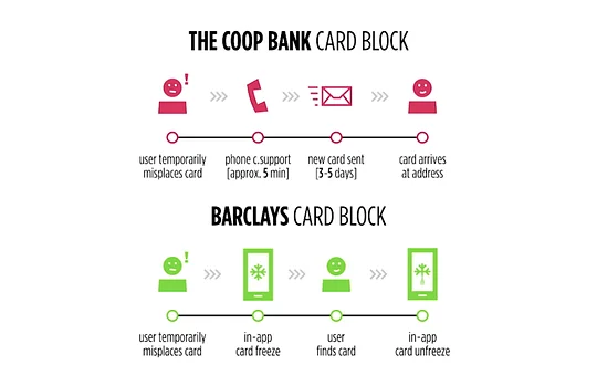
That said, many brands offer very little (if any) card block support, which is jarring when compared with those that do. Barclays have adopted the “fast follower” position, and initiated one-click card "freezing" and "unfreezing", whilst the Coop have not built card blocking functionality into their app. We can measure this functionality based on the ease with which card blocking and unblocking can be achieved, but also on how much control the user has over the experience.
The Coop
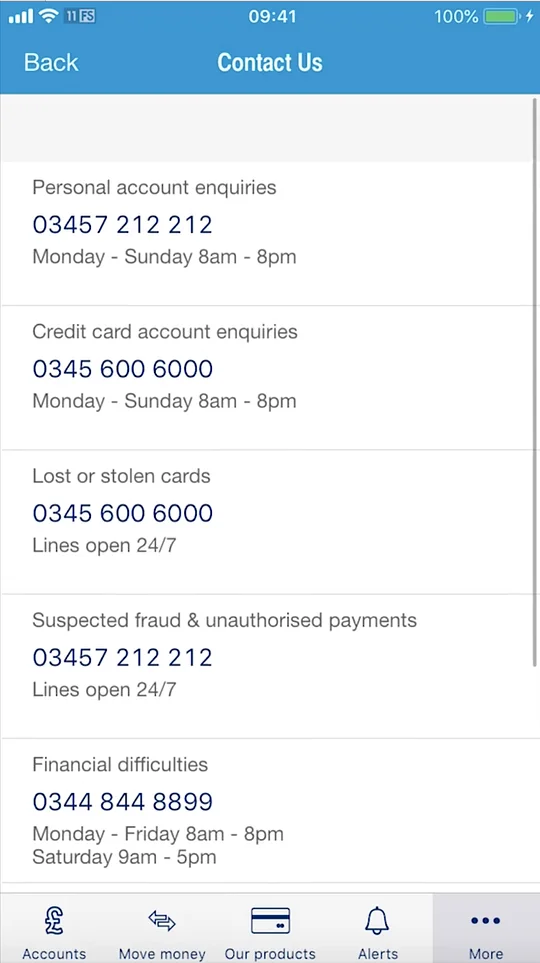
The Coop have made the task of effectively managing user card access very difficult, requiring that they choose a contact number and go through the arduous process of blocking their card using traditional customer support channels. As we can see from the video, the user is directed to the same number via both the “Help” and “Contact Us” pages, and no card management area is visible within their app.

The app does not include an automated process for putting a block on a card, to compete with the seamless experience offered by competing banks. It is vital that the user be able to complete their desired task within the app, so that friction is kept to a minimum; The Coop, however, choose to divert users towards their phone centres.
Barclays
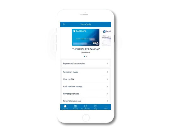
Though the card freeze play began in the challenger space, Barclays were amongst the first traditional banks to follow suit. They offer a simple path to the card freeze feature, which is accessible to users via the “Your Cards” area. Once there, the card selector carousel allows users to apply different settings, including card freeze, to multiple cards without leaving the page. This increases the efficiency of the system and allows users to complete the task more quickly. Finally, applying transparency to the card graphic makes users aware of its frozen status easily. Why does this represent a considerable sea change? For the first time, bank account holders can start to exercise control over their account, and rather than cancel cards, which disrupts the user’s day, they have flexible options for halting transactions in a way that fits their unique needs. According to a YouGov survey of 2016, around 12% of UK customers who lose their card end up finding it again soon after.
The cost of instances of “Account Takeover” rose in the UK to £24.4 million in 2016, an increase of one percent on the previous year. This process involves a criminal using another person's credit or debit card, first by gathering information about the victim, then contacting their bank or credit card issuer to masquerade as the genuine cardholder – one key method of preventing this would be to ensure that any cards the user holds are easily manageable via their app or desktop platform (in the instance that a phone is lost with the card).
The UX of making payments
Payments are no doubt one of the most divisive functions within a modern financial app, with two very clear positions defining the way players are approaching the topic. The question is, do brands forego security in order to ensure a slicker, friction-free process, or should they put as many security measures in place – no matter how much friction they generate – when the user is making payments.
Deutsche Bank
Deutsche Bank are leveraging technologies that users may not value, especially when compared with the negative impact they have on user experience when compared with others in the space. There’s some good stuff here, and the bank offers users slightly more flexibility in payment methods than many other banks by allowing them to make a payment via a document photograph, and a simple-to-use form for payment details with visually engaging graphics.
That said, the German bank requires users to confirm a payment using iTan transaction authentication within the app. The reason for using this service is understandable: iTan has the ability to reduce man-in-the-middle attacks on payments. However, this increases the time it takes to make a payment, requires the user to navigate away from the payment process and increases the memory load for users in recalling details of the transaction they have just entered. From a security standpoint this seems to be a positive decision, though some competitor challenger banks have foregone this step and delivered a better user experience as a result, without sacrificing user security. Despite such strong security verification being in place, consumers may lack trust in Deutsche Bank’s system, especially considering that earlier this year the bank made what became known as the $35 billion blunder – accidentally sending a collateral payment to an exchange it does business with. A bank’s ability to reduce friction at the expense of extra security steps depends to some extent on the trust its users have in its systems – the more customer support services are to trusted to clean up mistakes, the more banks can ensure friction-free, strong user journeys.
Revolut
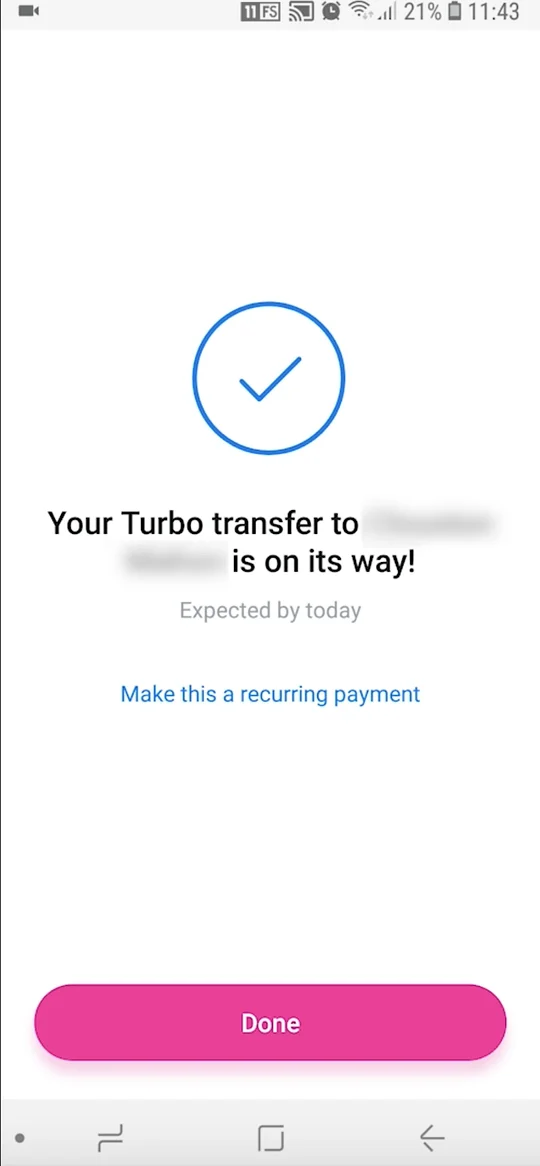
So, onto the challenger. Revolut’s payment process (shown above) is noteworthy for a number of reasons:
- Revolut provide a quick access navigation bar at the bottom of the screen for common actions, including payments, so users can complete their task quickly.
- Payment options are flexible, so users can easily complete their task in a way that suits their specific needs.
- Revolut payees are displayed in list and each item is formatted well, giving the correct priority to each piece of information to help users select the right recipient and reduce user error rate.
- Finally, initiating the payment is a seamless process, with no requirement of external products (such as Barclays’ PINsentry) or services (iTan, SMS, email) to complete the transaction. The time it takes to complete a transfer is very low as a result.
So there’s a very clear factor in play here, which is security. Revolut are able to initiate quicker payments by foregoing this extra security step, and trust in their core support functions should something go wrong during the process. The thinking being that the extra security step is less important to their users than the speed and ease of process here. Revolut's Product Owner for their Business offering gave us an insight into how the fintech works:
I think what differentiates Revolut is how we execute. We have a very fast-paced environment where everyone is questioned for what they do and how they do it. So it's not enough to say "users want this"; you have to think deeply about the problem, the people and the best possible solution out there. Then get rid of 90% of that and start working on the core stuff.
Nikolay Berezovsky, Product Owner/Senior Product Designer at Revolut
Measuring the cost of negative user experiences for your brand
Taking the time to assess individual user journeys can be helpful, especially when employing well-tested usability principles or benchmarking against competitors in your market. However, it is your actual users who will give you the best insights into the usefulness and usability of your product, and research involving users cannot be overlooked:
- Qualitative user research methods, such as usability testing or field studies, will help to understand why a negative experience might be occurring in the first place and, in some cases, offer viable solutions for addressing them.
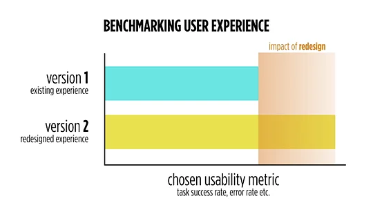
- Quantitative methods, such as studying website analytics, conducting A/B tests, or running quantitative usability studies, will help benchmark how an experience compares to an existing one – or even against others in the industry. This gives us the ability measure the impact a redesign has on ROI.
Nikolay Berezovsky of Revolut explained to us how important user feedback and data are to the fintech:
Interviews allow us to understand the context. Not just receive feature requests and suggestions but dig deeper into the problem and fix the root cause. And for sure, post-monitoring, Revolut is based on a data-driven approach. So the best feedback is numbers.
Nikolay Berezovsky, Product Owner/Senior Product Designer at Revolut
To do this sort of research, we need to take an initial measurement of the current design, using the quantitative methods mentioned above. We can collect metrics such as task success rate, time-on-task, conversion rate or drop-off rate. Understanding how these metrics impact parts of the business is an important part of the process, so we can see how changes in these numbers will affect the bottom line. Once we have a better picture of where the design currently stands, we can compare it with the same metrics gathered from a previous version. Seeing the differences between these numbers gives a clear indication of the value of improvements made to an experience that may have previously performed poorly.
Why are negative user experiences occuring?
1. No procedures in place for identifying negative experiences
We’ve written at length about the numerous methods that exist for identifying negative user experiences. Some require extensive resources, whereas others can be done with as little as a spreadsheet and an understanding of basic usability principles. Having no procedure in place to identify issues in your product is a surefire way to let both valuable insights and customers themselves, slip away.
2. Interpreting research results incorrectly
When analysing the results of your research efforts, regardless of the method used, it’s important to understand the distinction between an observation and an insight. The former is simply seeing something occur in front of you, while the latter seeks to understand what these observations mean for the user. Too often companies act upon granular observations, rather than focusing their design efforts on addressing the core needs of the user.
3. Poor at prioritising system improvements
Once areas for improvement have been identified, it can be difficult to determine which to address first. It’s recommended that you prioritise insights based on two key factors. The first is the potential impact for the user if addressed, measured by a factor of magnitude assigned to the issue and the frequency of the issue occurring. The second is the resources required to deliver the solution, including technical complexity and design requirement, among other project related costs. Plotting potential solutions on what is known as a “prioritisation matrix”, with each of these two parameters acting as the axis, can help with collective decision making.
Key takeaways
- When integrating third party services such as Intercom into a product, ensure a seamless experience is maintained. Also, limit the amount of information you require users to remember when moving from one service to another.
- Users might not have all the required information available to them when trying to complete a task, such as applying for a mortgage. Provide alternative routes for these users and ensure it is not possible to hit a dead end.
- Don’t ask too much of users when it comes to data entry. Explore options to accelerate form filling tasks like photo-based card recognition and social login.
- Don’t treat all customer pain points the same. A user who has lost their card indefinitely, versus one who has lost it temporarily, requires a very different solution.
- Use research methods like heuristic evaluation and competitive analysis as cost effective ways to compare your products against industry-standard usability principles and benchmark them against other products in a similar space.
- Use qualitative research methods to understand why an issue is occuring in the first place and go some way to exploring how to address it.
- Use quantitative research methods to size up and prioritise usability issues and provide a benchmark for the return-on-investment of design efforts.