The dark side of UX in insurance

Who knew design could get so dark? And no, we are not talking about dark mode.
Dark UX patterns are nothing new, most of us will have fallen victim to them when navigating the world of digital experiences. In many cases it may just be a cause of annoyance, an unsubscribe button that is buried deep within layers of navigation, or being greeted by a minefield of toggles and buttons to achieve the simplest of tasks.
So what exactly is dark UX? Put simply, it’s deception by design, used by businesses to serve their interests at the expense of their customers. Let’s take a look at some common dark UX tactics.
Friction
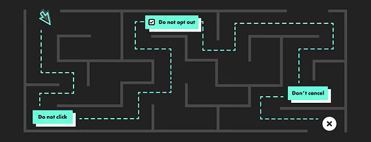
Perhaps the most common form of dark UX design. Simply put, it’s adding multiple unnecessary steps to a journey to prevent the user from taking an unwanted action. For example, the process of unsubscribing to a marketing email that requires so many steps, you may just give up halfway through. Designing in friction like this has the goal of actually increasing drop-off rates and therefore discouraging users from taking action.
Misdirection
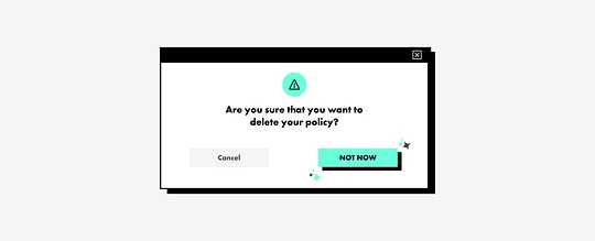
Another classic, misdirection, is the process of setting up consistent behaviour, then changing it before the user has realised. For example, placing a brightly coloured “next” button in a consistent location and then switching it with a button that does something completely different, ultimately leading to the user taking an action they didn’t intend to take.
Statement framing
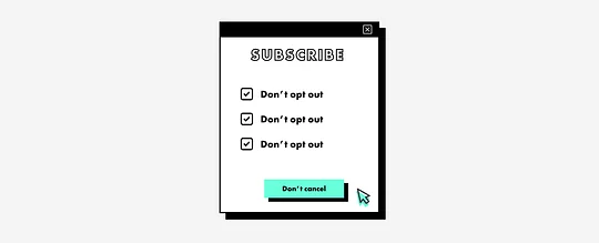
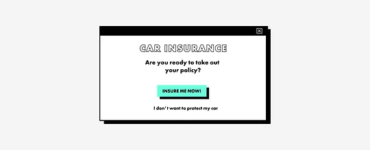
Statement framing is nothing new. It’s simply using language to trip someone into performing an action that will benefit the product by using fear or guilt. Even big businesses are prone to using this tactic. Take Facebook for example, they use language to play on people’s sense of goodwill, such as “allowing consent to your data will be helpful to people with visual impairment”. They’re trying to coerce a user into agreeing to terms through guilt. And while it’s worth saying the power of UX copywriting is in making things simple, it can be used for other motives.
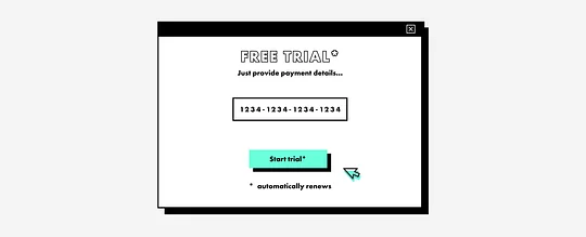
Forced continuity
A concept that will be familiar to most of us who use subscription services, forced continuity ensures that you roll into paid contracts even before you’ve finished your free trial period. In most cases these providers will ask for your payment details upfront, rolling you onto a paid contract with no reminder and without an easy get out.
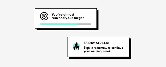
Gamification
Now this is a contentious one, but we could consider gamification to be a dark UX pattern, especially in the context of fintech. Gamifying financial experiences that in turn, may actually negatively affect its customers. For example, products like Robinhood use gamification techniques to encourage trading and push its users towards higher-risk investments. Some have even labelled the experience ‘slot machine’ in style, having an almost addictive quality in which users strive to unlock achievements and in doing so, risk more than they are actually comfortable with.
But what implications do these dark patterns have in the world of fintech?
In fintech it’s essential that experiences and products provide transparency and instill user confidence. Afterall, these products are handling confidential information and customers' money. Let’s Zoom in and look at the use of dark UX in insurance.
Dark UX in insurance
The insurtech space has been growing quickly, becoming saturated with startups that share an ambition to use mobile-first thinking to create a more seamless experience -a stark contrast to incumbents.
These newcomers, armed with new technology and new propositions, overcome the need to build in dark patterns and instead provide a great user experience.
Incumbents have often bamboozled customers with overbearing 50-page PDFs marked as ‘guides’ which bury relevant and important information from them. These add layers of friction to the customer understanding what the product is. In many cases leading to customers signing up for a product that doesn’t work for them.
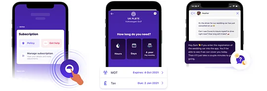
Instead, startups like car insurance app Cuvva or life insurance Vitality ensure that users only see the right information at the right time. They offer personalised and tailored experiences, ensuring that they guide their users in the right direction based on the information they have already provided. Post sign-up, rather than sending jargon filled PDF’s, proof is stored digitally, not only for safe keeping, but it also allows users to explore the information with ease. Searchable FAQ sections make it easier for customers to find what they’re looking for on their own.
Equally products like Cuvva often provide short-term insurance, avoiding getting stuck in rolling contracts or lengthy terms.
The claim process
Whether it’s car, life, health or any other type of insurance, If you’re having to make a claim, it’s usually not a great time. It’s in these moments that design needs to reassure and guide rather than frustrate and anger, but it’s often at these times where dark patterns crop up. Of course, these companies typically don’t want you to submit a claim so any layers of friction that may dissuade you from doing so are going to be supported. So what does friction look like in this experience?
The easiest way to dissuade a user to submit a claim is to actually hide the action. ‘Submit your claim’ buttons are often deeply buried in the product structures, making users have to navigate down many levels to even begin the claim journey. Once there, users are often met with lengthy forms, full of unnecessary fields asking for information the company already has. The final kicker is the copywriting and use of Statement framing. Language in this journey should be simple, concise and reassuring, but in many experiences, it’s littered with jargon, confusing terminology and unclear next actions, all making the journey of making a claim drawn out and encouraging user drop off. Often at this point, the only alternative is to turn to the phone and face a lengthy call wait before speaking to an advisor.
In contrast, products such as Cuvva or Lemonade ensure that this is the easiest part of their offering. Not constrained by old tech, inhibited by Iframes or in-app browsers, these products are able to create a stress-free but importantly frictionless experience to get access to funds. Gone have the lengthy PDF forms and long approval processes that may prevent users from making claims. Instead Lemonade uses AI to run dozens of anti-fraud algorithms, meaning the claimant can have their money in a matter of seconds. And when you do get into any confusion, live chat bots can give users the answers they need quickly.
The future of dark UX
While it’s clear to see that avoiding dark patterns is not only beneficial to a customer, it also helps build trust in a product. Through honesty and well designed user experiences, products do not need to rely on the shady past of dark UX to manipulate its customers, but instead, gain more following by creating compelling propositions that are a pleasure to use.
Luckily, we’re starting to see the back of dark UX patterns. But there’s still ample opportunity to harness the power of UX patterns for good. Positive UX experiences are good for customers and businesses.