High vs low brand: The ultimate guide to designing branded app experiences
When it comes to designing on-brand interfaces, there’s one thing you need to get right if you want to enhance your user experience rather than destroy it. And that’s knowing when to crank up your brand and when to dial it down.
You can craft the most beautiful app screens that bring your brand to life, but if you're yelling at your customer during moments when you should be quietly guiding them, you will have dialled up your brand to the detriment of usability.
Remember when 'brand' was the preserve of specialist above-the-line branding agencies? The digital creative team would wait patiently for them to reveal a set of rules and ingredients intended for print. It was only then that they’d set to work retro-fitting the brand to a digital experience.
Thankfully a rise in start-up culture, coupled with a shift in how consumers discover and experience brands, has allowed product design and brand creation to work in harmony. Brands launching online or through an app can adopt a digital-first philosophy and evolve their DNA around these moments.
I’m going to discuss the best ways to make your customers experience your brand through app design (although the principles also apply to web, wearable, and smart home devices).
What you workin’ with?
If we’re simplifying things, there are two familiar categories of brand ingredients at your disposal when helping someone experience a brand in-app.
These are identity and tone.
The baseline anatomy of a brand in UI therefore looks something like this:
Identity
- Colour palette
- Interaction language
- Typeface
- Icon set
- Movement
- Shape language
- Graphic devices
Tone
- UX writing
- Branded terminology
- Long-form content
These give you the digital building blocks to help make your brand more lovable than another for a user.
But how do you strike the right balance between usability and brand expression? To answer this, let’s explore the difference between low brand and high brand moments....
Low brand moments
‘Low brand' moments are the functional processes or screens that will likely form over 80% of an app experience.
Thanks to flat design (and any subsequent evolutions of the concept), the homogenisation of interfaces means paired-back minimalist design and common patterns make it much easier for a user to pick up an app and use it. But this also makes it harder for digital experiences to feel 'branded' and unique.
Users interacting with bland interfaces can still feel an affinity for a brand through what the product does for them and how it makes them feel, but if another app came along and did the same thing for less, or offered a better experience, they’d often have no trouble switching.
So in the context of a mobile app - where your logo has no business hogging any screen real estate - how can you create subtle, joined-up brand signatures, even during low brand moments?
It starts with establishing a consistent, recognisable baseline
All of the following elements need to echo your brand - it's not enough to simply have a logo and brand colour and hope for the best.
Colour roles & Interaction language
This one’s a biggie: your primary brand colour does not have to be your primary interaction colour. It’s all about creating the right emotional space within the UI.
As humans, we subconsciously have a strong emotional reaction to colour. If we wanted to create a sense of urgency through our button colours, we’d use a very different colour than if we wanted to create a sense of calm.
Understand the different contexts and number of levels required in your interaction hierarchy. Consider colour theory – how will these buttons work with your background, highlight and illustration colours to provide not only the right contrast, but the right emotional space?
Typeface
It feels a little unnecessary to point this out, but make sure at least the hero text carries a brand font. Some typefaces that give the distinctive look you’re after within headlines and marketing don’t actually offer a smooth reading experience for longer sections of copy, so you might want to use a secondary brand font for readability.
Shape language
When we talk about brand shape language, we’re referring to the common geometry that runs through graphic elements of your brand identity.
Is there a rounder feel to your logo that translates to rounded corners on content cards? Is there a loop or cut-out that’s mirrored in both your brand mark and your icon set?
Iconography and pictograms
In functional screens, your icon set is as important as your typeface.
Check that the angles, cap styles, density and stroke weights of your iconography borrow from the stylistic consistencies of your primary typeface and the shape language of your logo.

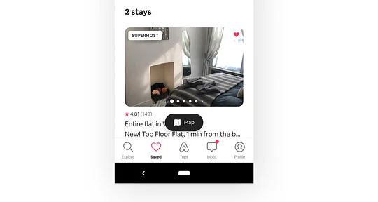
Look at how Airbnb’s icon set carries a line weight and complexity that feels like an extension of their logo. This is probably the hardest thing to get right, hence why a lot of brands miss the mark. It’s worth nerding out on.
Micro-interactions
Small, repeated movements like transitions and button behaviours should become a signature of your digital brand.
By making mundane interactions more delightful, we create tiny moments of serendipity that keep users coming back for more.
UX writing
This is the buttons, labels, titles and descriptions that guide a user through your product.
Where possible, these should use as few words as possible. Although this leaves little room for brand expression, copy should still feel authentic to your tone of voice. It seems obvious but if, for example, you’re a bank but your brand rules say ‘we don’t want to sound like a bank’, phrases like “new transaction” would have no place in your UI. “Make a payment” would be more ‘you’.
Branded terms
Consider the unique features or aspects your service offers. Can branding these using your own language help them feel less like an evolution of the ordinary and more like something new and revolutionary?
You only have to look at an iPhone’s feature list to see how effective this is. It doesn’t matter who’s providing it; video chat is video chat. Yet we talk about ‘FaceTiming’ friends thanks to Apple branding; the feature has become an ownable term.
What do we mean by a high brand moment?
Memorable examples we’ve seen from brands in recent years include:
When Monese flirted with a signature pay interaction:

When Monzo celebrated sign up wins with a joyous little animated card character:

Asana's ‘celebration creatures’ appearing when you tick things off:

All of these examples cause those little feel-good hits that come from something unexpected, delightful, original or just downright satisfying.
Over time, it’s these fleeting endorphin rushes that build up a depth of affection for your product experience.
But, designer, beware: dialling up your brand in highly functional or information-heavy moments can only serve to complicate matters unless your app has a very singular focus (think old-school Shazam’s singular big button).
How do I know when to turn up the volume?
To know where to dial up the brand, here are the 5 high brand opportunities.
Consider if the point in a journey, screen or interaction is either:
- Aligned with the service's main purpose,
- A moment that’s a ‘win’ for the user,
- An opportunity to add reassurance,
- A simple function that’s uniquely ownable, or
- A chance to promote premium features
Examples of this could be achieving a goal, making an investment, making a booking, sending a payment or completing onboarding.
In these moments, we can dial up the brand through:
Identity
Increased use of colour
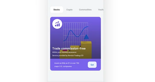
Unlike during low brand moments, where colour is mostly used to guide interaction, high brand moments can use colour to heighten the user experience.
An example of this is a moment where you can make premium features look enticing and exciting. Revolut’s 2020 rebrand hits the nail on the head when it promotes additional services like stocks, crypto and rewards through colourful cards.

Graphic design, illustration or imagery
Trying to engage the user with bright imagery and illustration during functional moments in the app is like your driving instructor trying to show you Tiktok videos during a 3 point turn. It’s distracting and stressful (not to mention inappropriate for a man of his years).
Using illustration or imagery that feels in line with your marketing collateral, but only during one of the 5 high brand opportunities, is an effective way to give your app experience a lift.
Animation
If we think beyond just micro-interactions, how can we work with illustration to bring movement and animated joy into the app experience?
We’ve recently seen Snoop effectively bring some joy into messaging through an animate robot character, for example.
Signature interactions
Signature interactions are a unique gesture or interface that helps you to complete the primary task offered by a service. Apple’s slide-to-answer function heralded a wave of gesture-based signature interactions that saw mundane tasks become something more deliberate and ownable.
This can prove gimmicky though, and always creates initial usability problems – not every app needs a unique gesture!
Instead, consider how the other brand ingredients can be amplified around your app’s most important interaction to create something memorable.
Tone
Increased brand personality
This one is simple. Through the high brand moments in your experience, applying a tone of voice that helps you celebrate wins, encourage behaviour or apologise for errors in a relatable, human way can create a stronger connection with your brand.
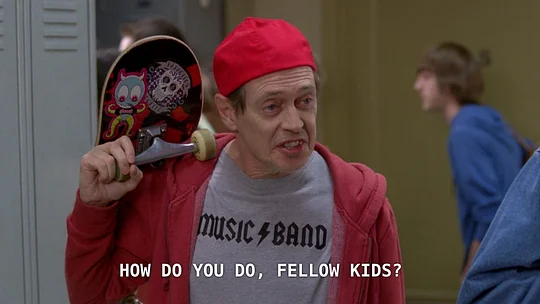
Dial things up, use provocative statements and exclamation marks, but make sure it feels authentic to your brand, not like a ‘cool dad’.

Longer-form content
Longer form content not only serves to give your brand more authority, but also offers a greater opportunity to flex your tone of voice.
Robinhood have created effective long-form educational content that carries their tone of voice, but this content can also carry through into the app experience.
As a strong counter to accusations of getting inexperienced investors into financial trouble, long-form content can play an important role in brand perception.
If you remember only one thing...
If you or your team find yourself randomly throwing colour, animation and excited phrases at your app in a bid to feel more unique and branded...
STOP.
Work harder on the consistent subtle nuances that join up the simplest ingredients so your low brand moments feel beautifully crafted.
If you’re saving your high brand efforts for the five opportunity areas, then you’ve got yourself a hit record. Think verses that follow the same rhythm, falling naturally into thumping choruses, that you grow to love more with every listen 🎶
If you're a digital brand looking to connect with a modern audience, check out our Minimum Lovable Brand (MLB) handbook. It's a modern, iterative approach to brand that's fit for start ups, designed to help you cut through the noise and punch above your weight.
