Pulse design process: Optimising for content discoverability
Take a peek behind the scenes of 11:FS Pulse. Keep reading to learn about the process 11:FS designers use to keep the Pulse product relevant, user friendly and ahead of the curve with a run through of the latest application of our design process.
Starting with insight
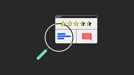
Each quarter we run a usability test to uncover new insights that will inform the ongoing development of Pulse. Users are given specific tasks with time allowed for follow up questions and open conversation.
A recent test focused on the first interaction a customer has with the platform. The core themes of our findings were:
- Discoverability of our content taxonomy and playlist feature
- Purpose of promotional content components
- Improvements to content recommendations
This meant we could leverage their expertise and unique interactions with customers to create solutions for some of the issues we found.
Collaborative ideation
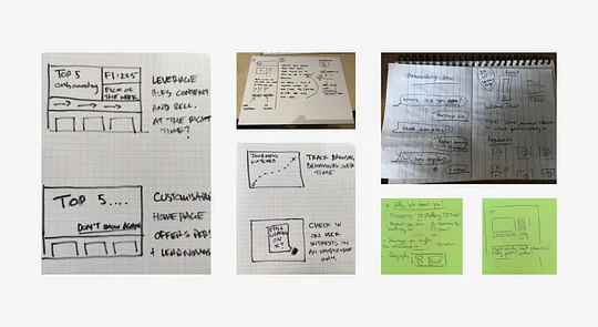
Next we ran an ideation workshop with members from across the Pulse team, including designers, researchers, engineers and content specialists. This meant we could leverage their expertise and unique interactions with customers to create solutions for some of the issues we found.
We start all design thinking workshops by sharing all the relevant insight needed to create useful solutions to a problem. That includes project-specific research insights like the ones mentioned above as well as foundational research artefacts like personas, customer Jobs to be Done, product vision statements and design principles.
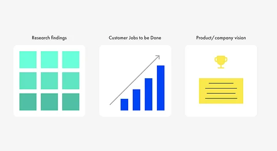
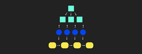
Most workshops follow a simple format of divergence, where ideas and information are extracted from participants, and convergence, where that data is prioritised and focused on. This pattern is repeated until we have a solution that’s well-defined enough that we can create something to test with users.
Prototyping
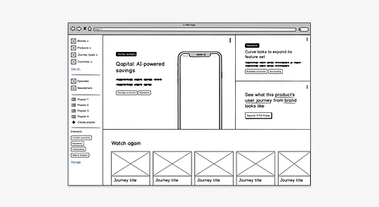
The goal of prototyping is to bring our ideas to life and start developing an end-to-end journey that we can test with representative customers. There are many ways we can test an idea, from landing page tests to low-fi wireframes. Jeff Gothelf’s book, Lean UX offers some useful ideas for how to test an MVP.
For this project, we went with a low-fi wireframe and incorporated some of the following ideas from our workshop into the prototype:
- An open-by-default side navigation drawer making our content taxonomy, insights and playlists more available to users on the homepage
- An interactive banner component with clearer labelling to highlight things like must watch journeys, new Homescreen episodes and recently published news insights
- Promotional playlist components to recommend curated lists of must watch content. For example ‘Top 10 crypto journeys’ from our resident blockchain expert Simon Taylor.
Gathering feedback
We conduct user testing in a number of different ways depending on what’s being tested and what questions we’re hoping to answer. Sometimes we’ll be gathering feedback on our live product to ensure it’s performing the way it should, which we do on a quarterly basis, and other times we’ll be testing new ideas for features we might one day incorporate into Pulse, which should be done whenever the need arises.
Getting feedback from people that didn’t already understand the proposition was key.
This time around, we recruited five users who had not used Pulse before and had a little-to-no knowledge of what it actually does. This was important, because we were testing our landing pages at the same time, so getting feedback from people that didn’t already understand the proposition was key.
Key findings from this stage included:
- Users were ok with us promoting 11:FS content that was freely available to non-subscribers, as long as it was relevant to their interests
- The addition of the labels to the banner component reduced uncertainty as to why a journey was being highlighted
- The curated playlist component was very well received and a 'Top 10' style list of must-watch journeys for a given domain gained a lot of interest
- Personalising the homepage with a Netflix-style list of content carousels was well-liked, as long as the recommendations were relevant
UI design
After making the necessary adjustments to our wireframes based on user feedback, it was time to develop them into build-ready designs. We designed each feature screen by screen to show core steps in the journey as well as any micro-interactions that are necessary to support the experience.
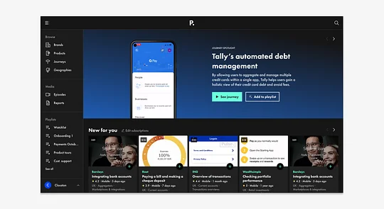
With every new journey or feature we design, we backfill our design system with new components
Admittedly, our design system is still in its infancy, but with every new journey or feature we design, we backfill our design system with new components and continue to consolidate our long list of styles into a more cohesive set of assets.
Preparing for development
A critical part of our design process is speccing designs in preparation for development. This includes user stories for each component part of the journey, along with the acceptance criteria we’ll test against once it’s been built and a link to the relevant designs.
Here’s an example of one of the many Jira tickets written for this project:
User story
As a user, I want to be able to see my playlists directly from the navigation menu so I can quickly access them from anywhere in the platform.
Acceptance criteria
Given: A logged-in user
When: They have the sidebar navigation open
Then: Every individual playlist will be shown, with the default “Watchlist” always shown at the top and the remaining playlists shown in order of date modified, from newest to oldest
(Link to relevant design files)
For more information about how to write good user stories, check out this great write-up from Atlassian.
Wrapping up
So that wraps up a typical cycle through the Pulse design process. At a high level, it’s a fairly common way of approaching design for a cross-functional agile product team, and, as with any feature we deliver, it has been iterated on a number of times over the years.
There are some aspects of it that are more unique to 11:FS, including how we use customer Jobs to be Done as part of our design process and how we measure the success of an initiative once delivered, but I think they deserve a blog post of their own.
I hope you’ve learned something new from reading this, or, at the very least, found comfort in the fact that others are doing things in the same way. Let us know if you have any questions or ideas to share, and keep an eye out for more content from the 11:FS design tribe.

