How to turn outdated corporate identities into fresh opportunities

As a designer, it’s an all too familiar scenario: you’re about to undertake work on an exciting new digital product or service. It has the potential to have it all, only for you to be handed what all product designers dread - the existing constraints of a rigid and outdated brand playbook.
It can certainly feel like a crushing blow.
But approached in the correct manner, these constraints can be transformed into an opportunity to take both the product and the brand to the next level.
How did we let this happen?!
Over the last decade, the transition to a digital economy has seen many products and services superseded by online challengers. And we’ve seen an irreversible shift in how people discover brands.
Many brands have reacted by simply replicating their existing services almost directly into a new medium, to prevent them falling behind their newer, more digitally savvy counterparts.
Unfortunately, brand playbooks have suffered largely the same fate. As a result, they’re often uninspired adaptations or extensions of their print ancestors.
So what can we do about it?
We operate in a world where customers now discover brands digitally, placing values and convenience over tangible labels.
New products and services entering the market with digital propositions are able to create brands and products in perfect harmony. A digital-first philosophy allows them to grow their brand’s DNA around the signature interactions experienced by its customers within the product itself.
This is one of the core reasons truly digital propositions - like challenger banks - are becoming major market disruptors. Successful challengers have discovered that the key to this conundrum is to create continuity between the brand as a visual identity and the values held by the business.
There are a number of ways they achieve this, and by considering the following approaches, you can too.
Adopt a digital-first approach to branding
We need to create brands designed to be felt through digital interactions, rather than retro-fitting a brand designed for the physical world.
We already have effective processes in place for iterative product design and development, and branding should be no different. The days of big branding updates every two years are outdated, and those who fail to adapt will be left behind.
Thankfully, the solution is relatively straightforward: by baking brand development into your product sprints in parallel with design you can ensure that brand is at the fore throughout the entire product creation process.
By evolving the core foundations found in the existing playbook, you’ll create a stronger, more modern brand with the ability to pivot in line with ever-changing consumer behaviours.
The days of big branding updates every two years are outdated, and those who fail to adapt will be left behind.
But where do we start?
There’s no doubt that many of the guidelines you inherit will need to be included in your designs. In no way are we suggesting you throw them out altogether; you’ll need them to create continuity with the existing brand.
But there are small changes that can make a seismic impact in evolving your brand for digital:
- Typography and iconography
Typography plays a key role in the application of any brand. Readability seems like all too obvious a consideration, but there’s a potential clash of importance between brand and function.
Firstly, don’t feel the pressure to simply replicate print type styles in a digital product if they might prove problematic for certain users to read.
Larger bodies of copy may require a more interface-friendly font for increased readability. And having the brand font as your hero or heading text will satisfy the representation of the identity through typography.
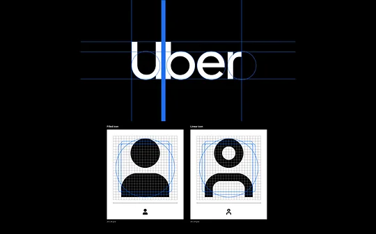
Iconography, if designed well, can help with this distinction by acting as an extension of the brand typeface. Taking your time to ensure that stroke weight, corner radii, angles and density all take inspiration from your typeface or the shape language of the logo is a worthwhile task - however time-consuming it might be.
2. Colour roles and interaction language
Accessibility is another non-negotiable when designing digital products.
Bright, impactful brands might work wonders in marketing circles, but all too often they hinder usability. Low colour contrast levels can make instructional actions harder to identify, making your product harder to use.
There’s no point having a beautiful and bold design if your customers struggle to use it!
Your primary brand colour doesn’t need to be your signature interaction colour - it’s far more important that the user can complete the task at hand. You can create a secondary palette for interactions that compliment the use of the primary colour.
Bright, impactful brands might work wonders in marketing circles, but all too often they hinder usability.
3. Signature moments
As a designer, this is your opportunity to create something that not only makes the experience more exciting, but unique and memorable.
There are 'high brand' moments in every user journey where you can dial up the brand and stamp some personality on the interaction. These can often be found in areas where:
- An action is aligned with the service’s main purpose
- The consumer celebrates a milestone or achievement
- There’s an opportunity to emphasise or explain an action
- A simple function is uniquely ownable
Consider how an increase in colour, movement or imagery can highlight and emphasise a key outcome or milestone in the customer’s relationship with the brand.
Simple moments of celebration can give your customers that small hit of dopamine in their success that will keep them coming back to your product. Coupling this with timely use of personalisation makes the experience even more powerful.
Big in-product brand moments have the power to shape a brand’s lasting impact on customers, as well as becoming the focal point of campaigns and customer acquisition strategies.
Over to you
Instead of viewing an outdated brand playbook as a constraint, you can choose to see it as an opportunity to modernise the brand through a well-crafted experience that’s entirely fit for purpose.
By consciously addressing the brand throughout your design process, you can create something unique and memorable without sacrificing or wasting the existing identity.
If you're a digital brand looking to connect with a modern audience, check out our Minimum Lovable Brand (MLB) handbook. It's a modern, iterative approach to brand that's fit for start ups, designed to help you cut through the noise and punch above your weight.


