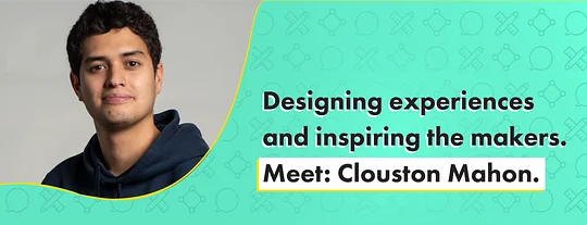
Designing experiences and inspiring the makers. Clouston Mahon

Sharing our stories, our challenges, and the things that truly matter to us. Today we talk to Clouston Mahon who is a UX lead in the 11:FS Pulse team to discuss what makes a great user experience, who is doing it well and looking outside of financial services for inspiration.
How do you define what a good digital experience looks like? How do you design financial services that truly work for the customer? And where does empathy come into it?
These are short questions with huge implications on how financial services are conceived, developed and delivered. They’re also not straightforward to answer with layers of context and nuance that need to be considered.
At 11:FS, one of the people asking those questions and diving into the world of digital user experience to find answers, is Clouston Mahon. He plays an integral role in design sprints for clients using his experience to help define what a great digital service looks and feels like. As UX Lead for 11:FS Pulse he also oversees the design and research activities to support that platform’s ongoing development.
From New Zealand to London, Clouston has lived and breathed design. Here he shares some of what he’s learned along the way and what excites him about the world of UX.
So we usually start with a pretty tough Q. What do you tell your friends and family what you do?
UX...that’s a big question, let’s touch on that a bit later.
11:FS Pulse. Well, it's such a unique product that I’ve had to come up with my own elevator pitch, which goes a bit like this:
Imagine you were a designer for a bank in New Zealand and you’d only heard of some of the amazing banking innovations coming out of Europe and beyond, without any context of what the experience looks like or how it’s been built. Pulse provides that context in the form of recordings of real people using those experiences, with a side of analysis to help our users assess the quality of the products.
In a nutshell, we’re trying to inspire and equip makers in FS with everything they need to build better stuff!
Actually this isn’t an easier follow up...but a stranger just asked you to describe 11:FS in one sentence.. What do you say?
I’m no marketeer, so it would be straight to the point. At its heart, 11:FS is a banking consultancy that specialises in successfully bringing new products to market for FS companies globally, and offers a suite of products that accelerates their ability to do so.
In a nutshell, we’re trying to inspire and equip makers in FS with everything they need to build better stuff!
What do you consider to be the most important things you’ve learnt since joining 11:FS?
I have three.
The importance and challenges of building a strong company culture.
An amazing approach to customer research called Jobs-To-Be-Done (we’re forced to recite a passage from Alan Klement’s When Coffee and Kale Compete each morning).
The unique opportunities that exist in financial services due to the connection people have with money.
What’s the proudest moment in your career?
Going back to my university where I studied design to present to a cohort of students was a pretty awesome experience, especially for an institution that gave me so much!
Speaking of going back, let’s hop halfway (and a bit more) around the world. You worked within an innovation hub for a large telco in your native New Zealand - Spark Ventures. How was that? Was that your introduction to the world of UX?
Spark was an amazing place to develop as a young designer because I was exposed to so many innovative companies that were being launched by their ventures wing.
NZ’s first subscription video-on-demand service was launched there, a smart home technology startup, big data and AI companies – it was a great place to be for tech in New Zealand!
Digital is not just transplanting existing processes into a digital format and calling it a day.
It was especially cool because as much as they were focused on launching new companies, there was an emphasis on developing practices that the wider group could adopt, which included a pretty well thought out approach to design. That kind of structure and support can be really helpful for a young designer and I think it really instilled an appreciation for ways of working in me.
And then you moved to the UK. What was it about London that attracted you? It can’t have been the weather...
It was actually my partner’s desire to fly the coop and see the world that brought me to London. I felt pretty lucky being able to do the work I was doing back in NZ and wasn’t actively seeking a change to that. But when she asked me if I’d go and after a bit of arm twisting, I ended up in London, which proved to be the best decision I (she?) ever made!
We’re now in month 3 and a bit of remote work. How have you found conducting design sprints and UX research while being fully remote?
11:FS has always been pretty flexible with remote working and Pulse has a global userbase, so doing user research remotely isn’t anything new.
More collaborative activities like workshops are getting easier to do online, but I’d still rather have them at the office. There’s just something about being able to slap a post-it on a real wall that makes team activities better.
Have you discovered, or rediscovered, any good tools you now can’t live without? I know a few of us are fully on the Miro train now.
Miro is old news, my friend. It’s all about Mural now 😂
It seems to be a bit better for things like workshops with some of the pre-built templates you can use. Figma is still the go-to design app and I use Notion for taking all kinds of notes, work-related or otherwise.
Taking the time to understand users' situations and the progress they want to make in life is how you can begin to create really useful products.
Going back to some basics, what is UX? If you had to explain it to someone who isn’t a UX expert what would you use as an example of ‘good’ UX to help them grasp what it’s all about?
Lazily insert image comparing a glass bottle of Heinz ketchup (UI) to a plastic squeeze bottle (UX) here.
But really, if you zoom out of any specific process or methodology, UX design is all about designing the experiences that people have with products, services or organisations. When you zoom back in to understand how that’s done, you come across things like Design Thinking, Lean UX, usability testing, which probably require their own blog posts to explain properly.
Feedback in the design sprint process is obviously critical. What’s the best, and worst, feedback you’ve received - genuinely has anyone ever said “we like it but could you move the button up a bit?”
I remember receiving some feedback that made me feel really conflicted.
I was working for a technology company and we were designing some new workflow tools for their teams. Most users agreed that it was an improvement and that it would save them time, but one person only had negative things to say about the designs.
We dug a little deeper and by the end of the session, they revealed that all the time saved by using this tool was time that the company wouldn’t need to employ them for, as most of their work was in the process of being automated. That was pretty hard to hear and made me learn to appreciate the human behind the efficiency.
You hear a lot of discussion about ‘empathic design’ but what does that actually mean? And do people know what it means when they say it?
What a timely question!
As above, I think it’s super important to appreciate the unique life situations that people are in and not assume you have “put yourself in their shoes” before even speaking to them. Simply taking the time to understand users' situations and the progress they want to make in life is how you can begin to create really useful products.
There’s just something about being able to slap a post-it on a real wall that makes team activities better.
It felt like many firms went down “we need an app route” early on with very mixed results. But they’ve since iterated them considerably - are there any FS companies out there you think are getting digital consistently right?
I recently picked car and travel insurance provider Cuvva and point-of-sale lender Klarna as examples of great digital experiences in our 2020 Pulse Awards Report.
I picked Cuvva as a product that was designed incredibly well for the unique situations people find themselves in when needing short-term insurance – onboarding customers in a matter of minutes and ensuring they are fully aware of what they are signing up for before their cover begins.
And Klarna, for the way they seamlessly integrated their own product into the checkout experiences of the brands customers already knew and loved. They are now in a position to solve industry specific problems with their financing products e.g. for retail – try before you buy from the comfort of your own home.
And what does good even look like? Is it a set of common traits, or design cues/ideas?
The UX gods Nielsen Norman Group define usefulness as utility + usability. In other words, help users do the things they need to in order to make progress and do it in a way that is both easy and pleasant.
That’s how I would measure “good” when it comes to design and how we assess all of the journeys in 11:FS Pulse.
I’ve learnt the importance of having a clear vision to guide your design, and for it to be grounded in things you believe in.
Are firms now approaching the digital challenge in a different way, or looking at digital services outside of financial services to inform their thinking?
I think they are coming to the realisation that digital is not just transplanting existing processes into a digital format and calling it a day. With that, comes an openness to actual problem solving that leverages digital to create more useful products.
There’s still instances where trying to reinvent the wheel at every opportunity just doesn’t offer a good return on investment, so keeping up with changes in the domain you operate in should be a prerequisite. But when firms get the basics right and have the opportunity to build something new, looking outside of the sector for inspiration is a must!
Okay final Q. You’ve also led the UX thinking and design process for evolving the 11:FS Pulse platform - what has that project taught you? And what are you looking to introduce next?
I’ve learnt the importance of having a clear vision to guide your design, and for it to be grounded in things you believe in, whether it be customer research, team values or company strategy (or all of the above!).
Designing a continuously developing product can be a long road, so it’s as important for you to be making progress as it is for your customers!
