Are you producing prototypes too early?

There is a popular belief that you have to 'make it real' as quickly as possible – “come on, just f*****g build the thing - it's the only way to learn!”. In many scenarios this belief is a dangerous myth, and here's why...
In the early stages of designing any new venture, all of the design work you do should be to validate an assumption. You want to be able to say “Hey people love the idea, give us more money!” (we all know it’s more nuanced than that, but go with me..)
When refining the proposition, blurring the lines between testing the proposition and testing the usability will waste effort and create a lack of focus. Also, no matter the sample size of your user testing, you'll have that niggling doubt in your head when you proudly tell investors 'this is a winner', that all you've proven is people can use it, not that they actually want it.
I believe the trick to lessening that doubt is knowing what you're asking your target customer to validate at each step of the process and using that to inform your design efforts and testing method.
What to ask, and when
During your early weeks you've hopefully understood your customer Jobs to be Done and the market opportunity. You've likely undergone some form of ideation and you have a rough concept. Next you'll be wanting to validate that concept and refine it. My approach would be:
> Do the minimum design production that gives you the maximum confidence about what your proposition should be
...allowing you to uncover what initial feature set you should build and get in users’ hands. Before that though, how do you make it 'feel' as real as possible to see if anyone wants it?
This is proposition testing.
What does the minimum design production look like?
The concern is not what do you need to design, but what questions you need an answer to.
At this stage we’re asking prospective customers “would you consider switching to, or adopting, this service?” and “which customer outcomes (and associated product features) represent the greatest pull factors?”.
So, while it's very tempting to jump into full user journeys and clickable prototypes, you must resist. Those are designed to help you answer a different set of questions, like “'do you understand how to use this product?” or “can you complete this task?”, focused more around utility and experience.
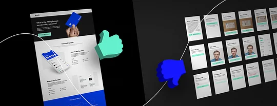
In my opinion testing materials at this stage should therefore look something like a landing page and not a lot more.
Any UI screens of the actual product are merely illustrative, they give your product benefits context and help conjure an idea of how it will work.
the online equivalent of putting an attractive shop front on an empty unit
We're looking for the online equivalent of putting an attractive shop front on an empty unit to see if a queue will form. If we hang product photos in the window, what are they most excited to come inside and buy?
What testing method gives you the most valuable insight early on?
While your proposition testing can simply be guided interviews through the material, additionally A/B testing different flavours of the proposition with a set of live social ads works well for consumer services.
- This process roughly follows:
Identify the different aspects of your proposition - Create adverts and landing page variants that in turn lean more heavily on each of those aspects
- Run a short, targeted social campaign to gauge click-through on each
- Measure sign-ups on each (building anticipation via a waitlist in the meantime)
- Understand which aspects of your proposition resonate best with your target customer and refine your MVP feature set.
This approach adds another couple of design tasks to your minimum testing materials list; brand and adverts.
In this instance your brand is a pseudo-brand whose primary job is to feel real (it also allows you to quickly test brand identity ideas) so should represent your best guess, not the result of a full process. When you end up changing the name or product, who cares? Those early registrations won't mind if you handle it the right way.
Why is this a better first step?
Voila, you made it seem real as early as possible, and you've given yourself much greater confidence that you're designing an MVP that people actually want.
Have you toiled over the UX?
Nope.
Have you had to bring each potential feature to life in an end-to-end journey just to see if it appeals?
Nope.
when it comes to building out UI flows you have less wasted effort
You spent a week designing assets, a couple of weeks running a social campaign, and collected an audience of sign ups to boot. Next, when it comes to building out UI flows you have less wasted effort and a community of potential users to engage in usability testing.
And later, when it comes to going to market with the right messaging, you can use this approach to better articulate how your product serves your customers’ unmet needs, better address their push/pull factors for switching and feel more culturally authentic.
Of course, it's your product performance and experience that will convert sign-ups to Monthly Active Users (MAUs) and referrals, but if no-one wants to get through the door, it's all to no avail.
Do I think there is anything wrong with a JFBI (Just F*****g Build It) attitude?
No.
But your first 'it' can be simpler than a clickable prototype.
If you’re grappling with how much of your brand assets to produce upfront, check out our guide - Minimum Lovable Brand.


